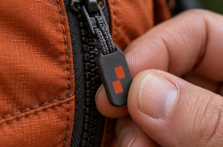
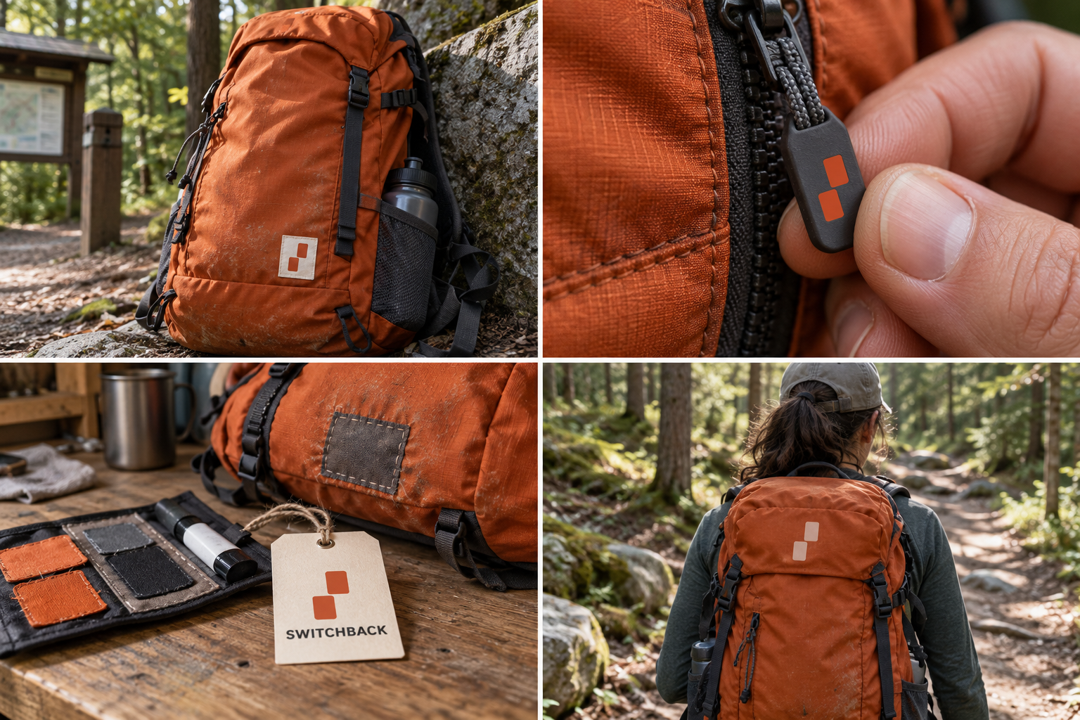
 Ripstop pack · 28 LMoulded zip pullRepair tag · lifetimeReflective trim
The brand out in the world. For print and production, use the editable vector files.
The idea behind it
A business first.
An identity with purpose.
Switchback is a concept brand for a maker of repairable day packs. Every pack ships with a patch kit, and on the first Saturday of each month the repair bench is open: bring a torn pack, leave with a fixed one. The customers are weekend walkers, not summit chasers.
On a marked trail, two painted blazes with the top one shifted mean the path turns here. Hikers learn to look for it on trees and rocks. Switchback uses that signal as its symbol: two painted bars, the upper one stepped across. People who walk trails already know it, and it is simple enough for a zip pull or a woven label.
The identity system
Everything SWITCHBACK needs to show up the same way, everywhere.
01Primary logo
02Logo mark alone
03Clear space
04Color system
#C9461CSymbol, zip pulls and pack panels
#F3EADALabels and light surfaces
#272D29Text and equipment details
#B1BC8ESecondary fabric accents
Watch: Two bars only mean 'the trail turns' to people who hike. Explain the blaze once, on the hang tag and the website, and let it build meaning from there.
05Brand pattern
06Typography
Torn it? Bring it back. We'll patch it.
A hiking-pack maker that borrows its symbol from the paint marks hikers already follow.
- Display · 56pxSWITCHBACK
- Heading · 30pxSWITCHBACK
- Body · 16pxSWITCHBACK
- Caption · 12pxSWITCHBACK
07Signage
08Stationery
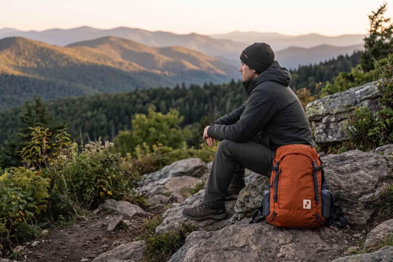
09In use
The voice
Torn it? Bring it back. We'll patch it.
Talks like the friend who knows the trail, not like a catalogue.
In everyday life
Designed to leave the screen.
- The double blaze printed on a rubber zip pull.
- A woven label on the pack's side pocket.
- A repair-bench tag: name, date, what was fixed.
Borrow the thinking
What could your
brand take from this?
- 01Borrow a signal your customers already read.
- 02Design for the smallest object first: here, a zip pull.
- 03Pick the color your customer is already looking for.
Your next chapter
A starting point.
Ready for your story.
Start from this brief, keep what fits and make it your own. Add your business name and BranDoor shapes everything around you.
Build my brand from this ↗Take the starter assets
Open any file to preview it here; download it when you're ready to use it.
Editable symbol

Brief & color palette
- What it is
- Repairable day packs and trail accessories for weekend walkers, with a free monthly repair bench and a symbol taken from painted trail blazes.
- Who it's for
- Day hikers and weekend walkers who value gear that lasts and can be fixed, rather than extreme-sport performance.
- Personality
- Keywords
- Avoid
- Palette
- Blaze orange
#C9461CSand#F3EADABasalt#272D29Moss#B1BC8E - Type · Voice
- Condensed grotesk + plain sans for care labels. Talks like the friend who knows the trail, not like a catalogue.
Mini brand guide
SWITCHBACK — starter guide
The story
Switchback is a concept brand for a maker of repairable day packs. Every pack ships with a patch kit, and on the first Saturday of each month the repair bench is open: bring a torn pack, leave with a fixed one. The customers are weekend walkers, not summit chasers.
The symbol
On a marked trail, two painted blazes with the top one shifted mean the path turns here. Hikers learn to look for it on trees and rocks. Switchback uses that signal as its symbol: two painted bars, the upper one stepped across. People who walk trails already know it, and it is simple enough for a zip pull or a woven label.
Color
- Blaze orange #C9461C — Symbol, zip pulls and pack panels
- Sand #F3EADA — Labels and light surfaces
- Basalt #272D29 — Text and equipment details
- Moss #B1BC8E — Secondary fabric accents
Blaze orange is the color hikers scan for in a green forest, so the symbol is easy to spot on a pack. Sand carries labels, basalt carries text and moss is a quiet secondary fabric.
Typography
Condensed grotesk + plain sans for care labels. Trail signs use short, compact lettering that reads from a distance. The same restraint suits pack labels; repair and care notes stay in a plain sans at a readable size.
Voice
Talks like the friend who knows the trail, not like a catalogue. Example: “Torn it? Bring it back. We'll patch it.”
What to borrow
- Borrow a signal your customers already read.
- Design for the smallest object first: here, a zip pull.
- Pick the color your customer is already looking for.
Concept brands are open starting points. Add your own name, adapt the artwork and make it yours. The typography is a direction to pair with fonts you choose.