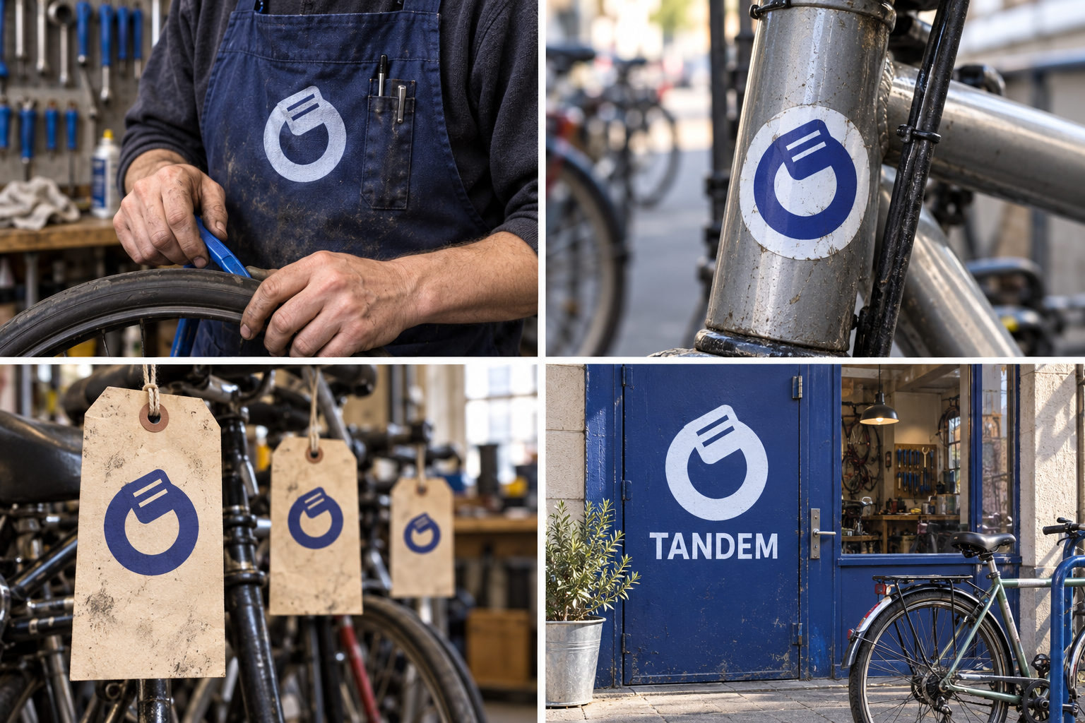
 Waxed canvas apronFrame decal · vinylNumbered collection ticketDoor vinyl
The brand out in the world. For print and production, use the editable vector files.
The idea behind it
A business first.
An identity with purpose.
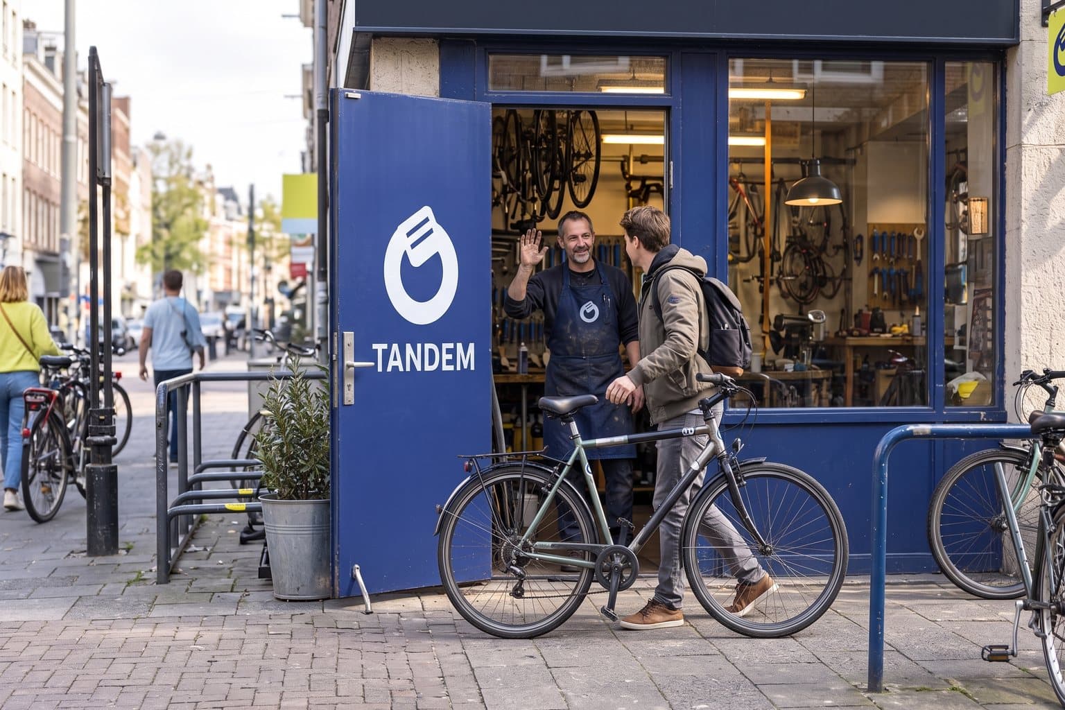
Tandem is a concept brand for a bicycle workshop next to a busy commuter route. Drop a bike off before 9am, collect it after 5pm. Most bikes that come in have a puncture, and most riders just want it fixed without a lecture.
Most of a bike workshop's day is mending flat tyres. Tandem's symbol is an inner tube with a patch on it: the most common repair, drawn so it looks friendly rather than technical. It says 'we'll fix it' without a word, and it is bold enough for a frame sticker, an apron or the workshop door.
The identity system
Everything TANDEM needs to show up the same way, everywhere.
01Primary logo
02Logo mark alone
03Clear space
04Color system
#303E99Shopfront and frame symbol
#E9EFFBService cards and backgrounds
#DDF15AVisibility accents
#252B3ASmall text and pricing
Watch: At a glance the patch can read as a sticking plaster. That is part of the charm: it is a repair, and that is the business.
05Brand pattern
06Typography
In by 9. Fixed by 5. Or we'll call you.
A neighborhood bike workshop whose symbol is the repair it does most: a patched inner tube.
- Display · 56pxTANDEM
- Heading · 30pxTANDEM
- Body · 16pxTANDEM
- Caption · 12pxTANDEM
07Signage
08Stationery
09In use
The voice
In by 9. Fixed by 5. Or we'll call you.
Straight answers, no jargon, no judgement about your old bike.
In everyday life
Designed to leave the screen.
- A frame sticker given back with every repaired bike.
- A workshop apron with the patched tube on the chest.
- A collection ticket: name, bike, 'ready by 5'.
Borrow the thinking
What could your
brand take from this?
- 01Make your most ordinary job the symbol.
- 02A little humor makes a technical service approachable.
- 03Put the promise in numbers: in by 9, fixed by 5.
Your next chapter
A starting point.
Ready for your story.
Start from this brief, keep what fits and make it your own. Add your business name and BranDoor shapes everything around you.
Build my brand from this ↗Take the starter assets
Open any file to preview it here; download it when you're ready to use it.
Editable symbol

Brief & color palette
- What it is
- A neighborhood bicycle workshop on a commuter route offering same-day repairs, with a symbol of a patched inner tube.
- Who it's for
- City commuters and casual riders who need their bike fixed quickly and plainly, without specialist jargon.
- Personality
- Keywords
- Avoid
- Palette
- Racing indigo
#303E99Pale blue#E9EFFBCitrus#DDF15AAsphalt#252B3A - Type · Voice
- Heavy grotesk + clear utility sans. Straight answers, no jargon, no judgement about your old bike.
Mini brand guide
TANDEM — starter guide
The story
Tandem is a concept brand for a bicycle workshop next to a busy commuter route. Drop a bike off before 9am, collect it after 5pm. Most bikes that come in have a puncture, and most riders just want it fixed without a lecture.
The symbol
Most of a bike workshop's day is mending flat tyres. Tandem's symbol is an inner tube with a patch on it: the most common repair, drawn so it looks friendly rather than technical. It says 'we'll fix it' without a word, and it is bold enough for a frame sticker, an apron or the workshop door.
Color
- Racing indigo #303E99 — Shopfront and frame symbol
- Pale blue #E9EFFB — Service cards and backgrounds
- Citrus #DDF15A — Visibility accents
- Asphalt #252B3A — Small text and pricing
Racing indigo is calm and readable on a busy street. Citrus is the high-visibility color commuters already wear; pale blue and asphalt carry service cards and prices.
Typography
Heavy grotesk + clear utility sans. Compact, heavy letters work on a shopfront and a sticker. Prices and collection times stay in a plain sans so they are impossible to misread.
Voice
Straight answers, no jargon, no judgement about your old bike. Example: “In by 9. Fixed by 5. Or we'll call you.”
What to borrow
- Make your most ordinary job the symbol.
- A little humor makes a technical service approachable.
- Put the promise in numbers: in by 9, fixed by 5.
Concept brands are open starting points. Add your own name, adapt the artwork and make it yours. The typography is a direction to pair with fonts you choose.