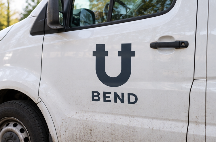
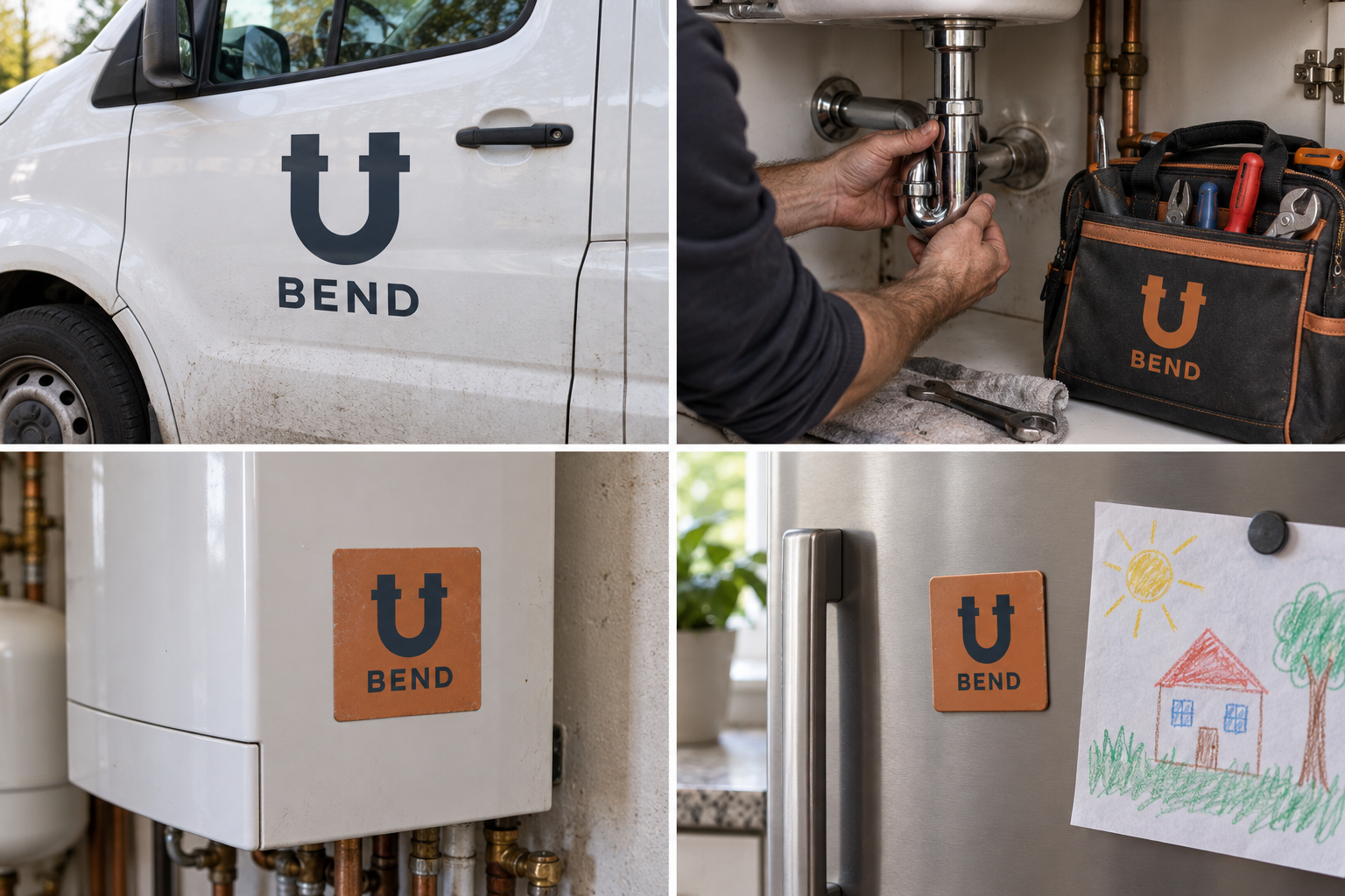
 Van livery · 24/7Service tagBoiler sticker · next serviceFridge magnet · call-out
The brand out in the world. For print and production, use the editable vector files.
The idea behind it
A business first.
An identity with purpose.
Bend is a concept brand for a three-person plumbing and heating firm. They give a one-hour arrival window, wear shoe covers indoors and send a photo of the finished job. Half their calls are blocked sinks; the other half are boilers that stopped on the coldest morning of the year.
Under every sink there is a pipe bent into a U. It holds a little water so smells cannot come back up, and it is where most blockages end up. Plumbers know it better than any other part. Bend's symbol is that trap, with its two nuts, drawn bold enough for a van door and simple enough for a fridge magnet.
The identity system
Everything BEND needs to show up the same way, everywhere.
01Primary logo
02Logo mark alone
03Clear space
04Color system
#26333DSymbol, vans and uniforms
#C06A34Signature accents and stickers
#F4F4EFInvoices and light surfaces
#8EC5D6Small heating and water notes
Watch: To some people a U shape is just a magnet or a horseshoe. The pipe nuts make it plumbing; never simplify them away.
05Brand pattern
06Typography
It was the trap. It's clear now. Here's a photo.
A local plumbing firm whose symbol is the pipe under every sink: the U-bend.
- Display · 56pxBEND
- Heading · 30pxBEND
- Body · 16pxBEND
- Caption · 12pxBEND
07Signage
08Stationery
09In use
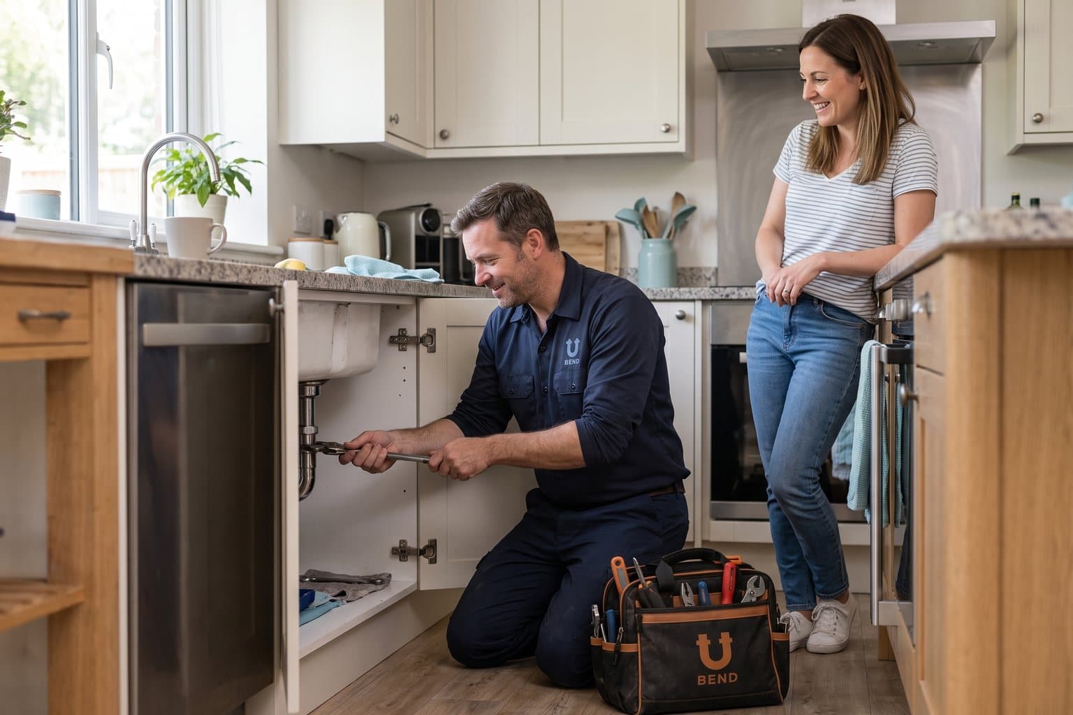
The voice
It was the trap. It's clear now. Here's a photo.
Straight-talking and tidy, like a plumber who explains what they found.
In everyday life
Designed to leave the screen.
- The U-bend large on the van's side doors.
- A boiler service sticker with the date of the next check.
- A fridge magnet with the phone number under the symbol.
Borrow the thinking
What could your
brand take from this?
- 01Draw the part that does the work, not the tool.
- 02A detail like the nuts can carry the whole meaning.
- 03Leave something useful behind: a service sticker, not a brochure.
Your next chapter
A starting point.
Ready for your story.
Start from this brief, keep what fits and make it your own. Add your business name and BranDoor shapes everything around you.
Build my brand from this ↗Take the starter assets
Open any file to preview it here; download it when you're ready to use it.
Editable symbol

Brief & color palette
- What it is
- A local plumbing and heating firm with one-hour arrival windows, tidy work and a photo of every finished job, using the U-bend trap as its symbol.
- Who it's for
- Homeowners and landlords who want reliable, clean, clearly priced plumbing without surprises.
- Personality
- Keywords
- Avoid
- Palette
- Slate
#26333DCopper#C06A34Enamel#F4F4EFWater blue#8EC5D6 - Type · Voice
- Engineered sans + plain text sans. Straight-talking and tidy, like a plumber who explains what they found.
Mini brand guide
BEND — starter guide
The story
Bend is a concept brand for a three-person plumbing and heating firm. They give a one-hour arrival window, wear shoe covers indoors and send a photo of the finished job. Half their calls are blocked sinks; the other half are boilers that stopped on the coldest morning of the year.
The symbol
Under every sink there is a pipe bent into a U. It holds a little water so smells cannot come back up, and it is where most blockages end up. Plumbers know it better than any other part. Bend's symbol is that trap, with its two nuts, drawn bold enough for a van door and simple enough for a fridge magnet.
Color
- Slate #26333D — Symbol, vans and uniforms
- Copper #C06A34 — Signature accents and stickers
- Enamel #F4F4EF — Invoices and light surfaces
- Water blue #8EC5D6 — Small heating and water notes
Slate keeps the symbol strong on white vans and paperwork. Copper is the pipework, enamel is the bathroom white and water blue is a small accent for heating and cold-water notes.
Typography
Engineered sans + plain text sans. A solid, engineered sans looks dependable on a van and an invoice. Prices, time slots and safety notes use a plain sans with clear numbers.
Voice
Straight-talking and tidy, like a plumber who explains what they found. Example: “It was the trap. It's clear now. Here's a photo.”
What to borrow
- Draw the part that does the work, not the tool.
- A detail like the nuts can carry the whole meaning.
- Leave something useful behind: a service sticker, not a brochure.
Concept brands are open starting points. Add your own name, adapt the artwork and make it yours. The typography is a direction to pair with fonts you choose.