
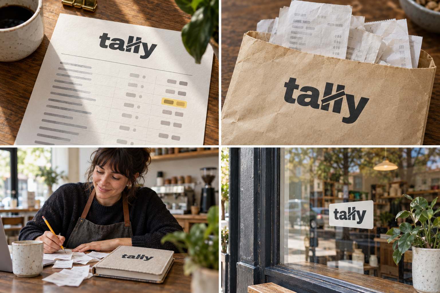
 Monthly report · A4Receipt envelope · C5Desk notepadWindow sticker
The brand out in the world. For print and production, use the editable vector files.
The idea behind it
A business first.
An identity with purpose.
Tally is a concept brand for a two-person bookkeeping service for cafes, salons and trades. Receipts get photographed, the books are done every month and the owner gets one page in plain English. Nobody is made to feel bad about a shoebox of receipts.
When people count by hand, they draw four lines and strike the fifth across them. It is called a five-bar gate and almost everyone has drawn one. In Tally's logo, the name does the counting: the two l's are the bars, and one clean strike crosses them, cut so it reads as drawn over the top. It feels human rather than corporate, and it says what the service does: counts everything, carefully.
The identity system
Everything Tally needs to show up the same way, everywhere.
01Primary logo
02Compact mark
03Clear space
04Color system
#3A3D42Wordmark and essential text
#FBF8EFReports and backgrounds
#CFE3C8Tables and secondary fields
#F3E86AThe number that matters
Watch: Graphite and pale green are quiet. Tally relies on the highlighter yellow for energy; use it for one number at a time, never as decoration.
05Brand pattern
06Typography
Snap the receipt. We'll do the counting.
A bookkeeping service whose name is the logo: the two l's become tally bars, struck through like the oldest way of counting.
- Display · 56pxTally
- Heading · 30pxTally
- Body · 16pxTally
- Caption · 12pxTally
07Signage
08Stationery
09In use

The voice
Snap the receipt. We'll do the counting.
Clear and unjudging, like an accountant who is also a friend.
In everyday life
Designed to leave the screen.
- The monthly one-page report with the wordmark at the top.
- A receipt envelope for the end of each month.
- A window sticker: 'Our books are done by Tally'.
Borrow the thinking
What could your
brand take from this?
- 01When the letters already look like the idea, let them carry it.
- 02Design for the document clients actually read.
- 03Use one accent for one job.
Your next chapter
A starting point.
Ready for your story.
Start from this brief, keep what fits and make it your own. Add your business name and BranDoor shapes everything around you.
Build my brand from this ↗Take the starter assets
Open any file to preview it here; download it when you're ready to use it.
Editable wordmark

Brief & color palette
- What it is
- Friendly monthly bookkeeping for small businesses, with a one-page plain-English report and a wordmark whose double l is struck through like a tally count.
- Who it's for
- Owners of cafes, salons and trade businesses who want tidy books without jargon or judgement.
- Personality
- Keywords
- Avoid
- Palette
- Graphite
#3A3D42Ledger paper#FBF8EFLedger green#CFE3C8Highlighter#F3E86A - Type · Voice
- Heavy grotesk wordmark + humanist sans with tabular figures. Clear and unjudging, like an accountant who is also a friend.
Mini brand guide
Tally — starter guide
The story
Tally is a concept brand for a two-person bookkeeping service for cafes, salons and trades. Receipts get photographed, the books are done every month and the owner gets one page in plain English. Nobody is made to feel bad about a shoebox of receipts.
The wordmark
When people count by hand, they draw four lines and strike the fifth across them. It is called a five-bar gate and almost everyone has drawn one. In Tally's logo, the name does the counting: the two l's are the bars, and one clean strike crosses them, cut so it reads as drawn over the top. It feels human rather than corporate, and it says what the service does: counts everything, carefully.
Color
- Graphite #3A3D42 — Wordmark and essential text
- Ledger paper #FBF8EF — Reports and backgrounds
- Ledger green #CFE3C8 — Tables and secondary fields
- Highlighter #F3E86A — The number that matters
Graphite is pencil on paper and keeps the wordmark serious. Ledger paper and ledger green are the books themselves, and highlighter marks the one number the owner needs to see.
Typography
Heavy grotesk wordmark + humanist sans with tabular figures. A heavy, compact grotesk gives the wordmark weight on a small window sticker, and a humanist sans keeps money conversations warm. All figures are tabular so columns line up on the monthly page; anything that looks like a spreadsheet stays out of the marketing.
Voice
Clear and unjudging, like an accountant who is also a friend. Example: “Snap the receipt. We'll do the counting.”
What to borrow
- When the letters already look like the idea, let them carry it.
- Design for the document clients actually read.
- Use one accent for one job.
Concept brands are open starting points. Add your own name, adapt the artwork and make it yours. The typography is a direction to pair with fonts you choose.