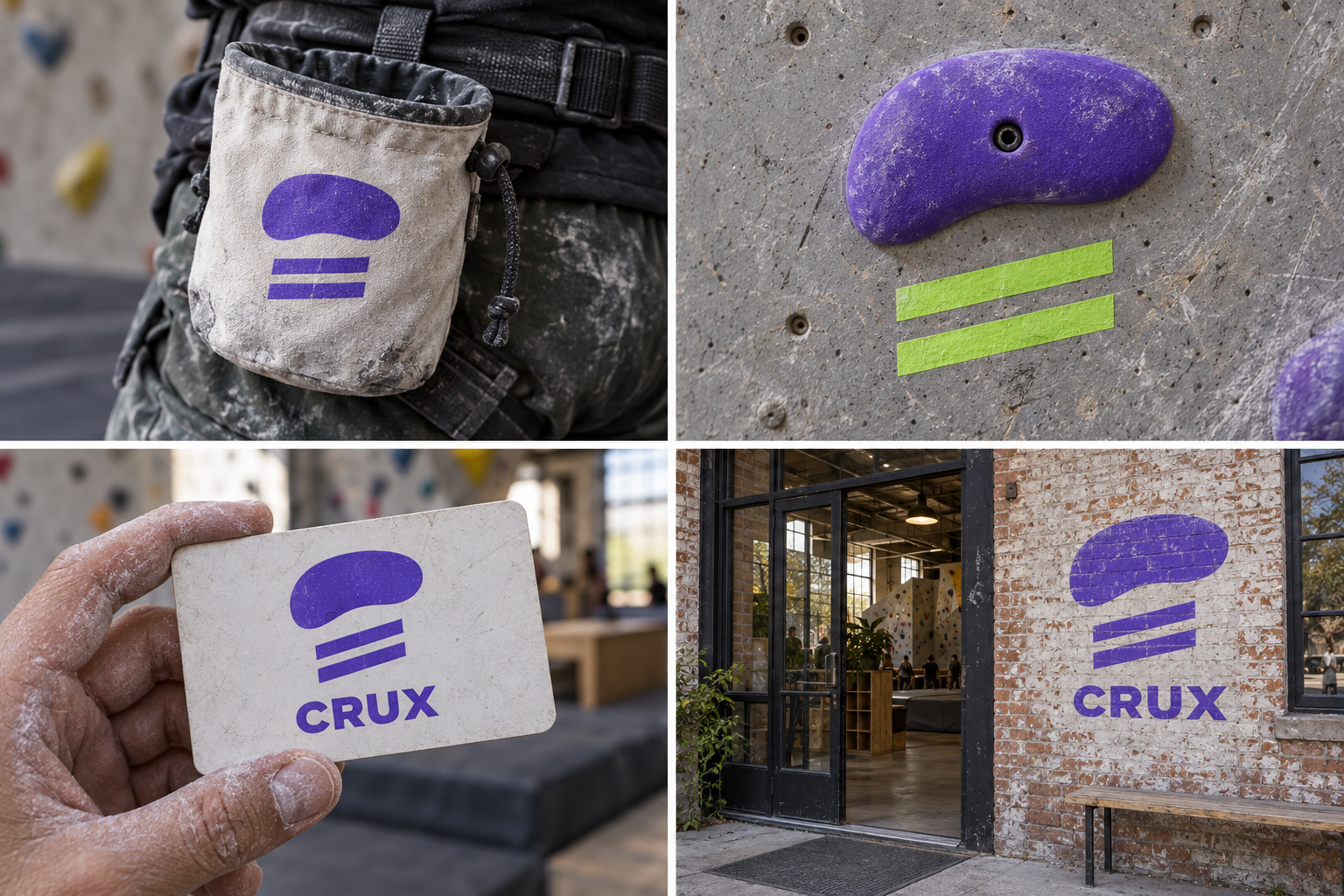
 Chalk bag · embroideredStart tape · V3Membership cardEntrance wall mural
The brand out in the world. For print and production, use the editable vector files.
The idea behind it
A business first.
An identity with purpose.
Crux is a concept brand for a bouldering gym in an old warehouse, with new problems set every Tuesday. Half the members had never climbed before they joined. The Thursday beginner session ends with everyone sitting on the mats, comparing chalky hands.
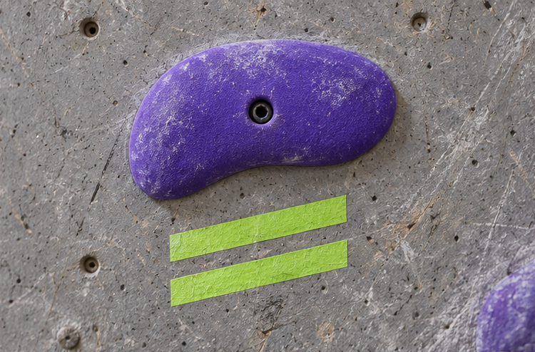
In a bouldering gym, the first hold of each problem is marked with two strips of tape underneath it. Every climber looks for those strips before they start. Crux's symbol is a hold with that tape below: an invitation to start, and something only climbers would think to draw.
The identity system
Everything CRUX needs to show up the same way, everywhere.
01Primary logo
02Logo mark alone
03Clear space
04Color system
#5B3FD6Symbol, shirts and wall signs
#F6F5F1Light surfaces and posters
#2B2D31Text and dark fields
#D4EE5EStart tape and new-route highlights
Watch: Out of context, the hold can look like a blob or a cloud. The two tape strips are essential; show the mark on a real wall early so it reads as a climbing hold.
05Brand pattern
06Typography
Fell off? Same. Try the left foot.
A neighborhood bouldering wall whose symbol is the tape that marks where a climb begins.
- Display · 56pxCRUX
- Heading · 30pxCRUX
- Body · 16pxCRUX
- Caption · 12pxCRUX
07Signage
08Stationery
09In use
The voice
Fell off? Same. Try the left foot.
Encouraging and a bit nerdy about climbing, never macho.
In everyday life
Designed to leave the screen.
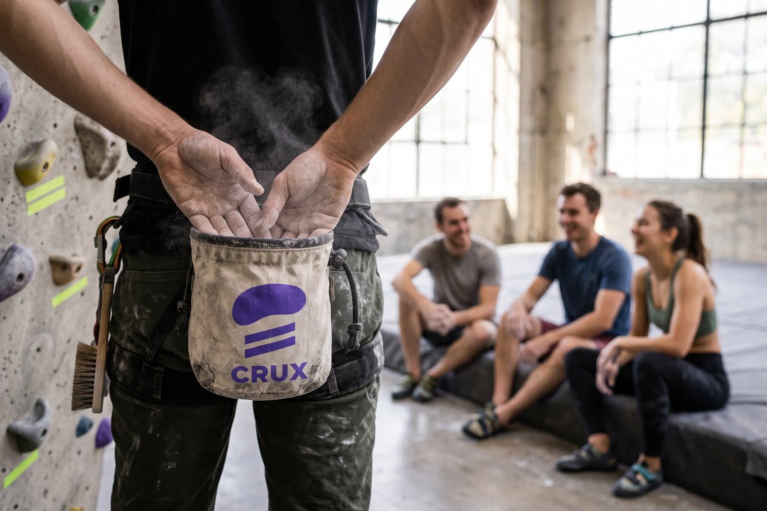
- The symbol printed on a chalk bag.
- Two strips of lime tape under a violet start hold.
- A membership card with the symbol and member number.
Borrow the thinking
What could your
brand take from this?
- 01Look for the small marker that starts the activity.
- 02Choose a color the category does not already own.
- 03Design for people who are still nervous, not only experts.
Your next chapter
A starting point.
Ready for your story.
Start from this brief, keep what fits and make it your own. Add your business name and BranDoor shapes everything around you.
Build my brand from this ↗Take the starter assets
Open any file to preview it here; download it when you're ready to use it.
Editable symbol

Brief & color palette
- What it is
- A welcoming bouldering gym with weekly route setting and beginner sessions, using the start-hold tape as its symbol.
- Who it's for
- Beginners and regular climbers who want a social, unintimidating place to climb after work.
- Personality
- Keywords
- Avoid
- Palette
- Electric violet
#5B3FD6Chalk#F6F5F1Granite#2B2D31Tape lime#D4EE5E - Type · Voice
- Chunky grotesk + compact sans for grades. Encouraging and a bit nerdy about climbing, never macho.
Mini brand guide
CRUX — starter guide
The story
Crux is a concept brand for a bouldering gym in an old warehouse, with new problems set every Tuesday. Half the members had never climbed before they joined. The Thursday beginner session ends with everyone sitting on the mats, comparing chalky hands.
The symbol
In a bouldering gym, the first hold of each problem is marked with two strips of tape underneath it. Every climber looks for those strips before they start. Crux's symbol is a hold with that tape below: an invitation to start, and something only climbers would think to draw.
Color
- Electric violet #5B3FD6 — Symbol, shirts and wall signs
- Chalk #F6F5F1 — Light surfaces and posters
- Granite #2B2D31 — Text and dark fields
- Tape lime #D4EE5E — Start tape and new-route highlights
Electric violet is unusual for climbing and stands out against grey walls and crash mats. Chalk is the light ground, granite is text and tape lime marks start holds and new routes.
Typography
Chunky grotesk + compact sans for grades. Chunky letters feel energetic on walls and shirts. Grades, opening hours and route-setting days use a compact sans that reads across a busy room.
Voice
Encouraging and a bit nerdy about climbing, never macho. Example: “Fell off? Same. Try the left foot.”
What to borrow
- Look for the small marker that starts the activity.
- Choose a color the category does not already own.
- Design for people who are still nervous, not only experts.
Concept brands are open starting points. Add your own name, adapt the artwork and make it yours. The typography is a direction to pair with fonts you choose.