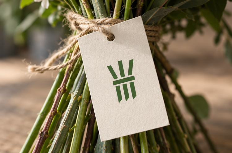
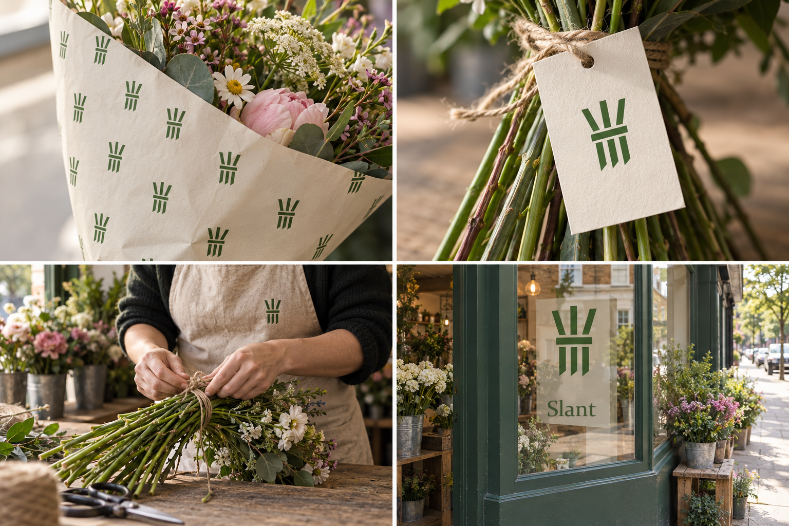
 Printed wrap · repeatCare card · trim at an angleTied to orderWindow vinyl
The brand out in the world. For print and production, use the editable vector files.
The idea behind it
A business first.
An identity with purpose.
Slant is a concept brand for a flower shop on a busy corner. Bunches are tied in front of the customer and every one comes with a tiny care card. On Fridays, everything left in the buckets becomes a five-pound 'end of week' bunch.
Florists cut every stem on a slant so the flowers can drink more water. Customers see it each time a bunch is trimmed, and it gives the shop its name. Slant's symbol is three stems tied with string, each cut on that angle. It avoids the obvious flower icon and quietly says the flowers have been looked after properly.
The identity system
Everything Slant needs to show up the same way, everywhere.
01Primary logo
02Logo mark alone
03Clear space
04Color system
#45702FSymbol and wrapping prints
#FFF6ECPaper, cards and backgrounds
#EFA3B6Gift cards and ribbons
#C9A46AString and small details
Watch: Without flower heads, some people will take a moment to see a bouquet. That pause is the point; the angled cut and the twine make it read as cut flowers.
05Brand pattern
06Typography
Trim on an angle. Fresh water every two days.
A flower shop whose symbol is the part nobody draws: three stems, cut on a slant and tied.
- Display · 56pxSlant
- Heading · 30pxSlant
- Body · 16pxSlant
- Caption · 12pxSlant
07Signage
08Stationery
09In use
The voice
Trim on an angle. Fresh water every two days.
Generous and lightly romantic, with practical advice tucked in.
In everyday life
Designed to leave the screen.
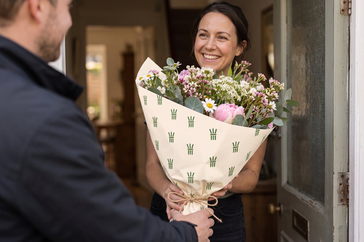
- The symbol printed on wrapping paper around a bunch.
- A care card tied to the stems with twine.
- A shop-window decal of the three stems.
Borrow the thinking
What could your
brand take from this?
- 01Draw the part of the product no competitor draws.
- 02Turn good practice into the symbol.
- 03Let care instructions carry the brand story.
Your next chapter
A starting point.
Ready for your story.
Start from this brief, keep what fits and make it your own. Add your business name and BranDoor shapes everything around you.
Build my brand from this ↗Take the starter assets
Open any file to preview it here; download it when you're ready to use it.
Editable symbol

Brief & color palette
- What it is
- A corner flower shop tying bunches to order, with care cards on every bunch and a symbol of three stems cut on an angle.
- Who it's for
- Local shoppers buying flowers for their home or as a gift, who want them to last longer than a few days.
- Personality
- Keywords
- Avoid
- Palette
- Stem green
#45702FWrap paper#FFF6ECPeony#EFA3B6Twine#C9A46A - Type · Voice
- Elegant serif + simple sans for care cards. Generous and lightly romantic, with practical advice tucked in.
Mini brand guide
Slant — starter guide
The story
Slant is a concept brand for a flower shop on a busy corner. Bunches are tied in front of the customer and every one comes with a tiny care card. On Fridays, everything left in the buckets becomes a five-pound 'end of week' bunch.
The symbol
Florists cut every stem on a slant so the flowers can drink more water. Customers see it each time a bunch is trimmed, and it gives the shop its name. Slant's symbol is three stems tied with string, each cut on that angle. It avoids the obvious flower icon and quietly says the flowers have been looked after properly.
Color
- Stem green #45702F — Symbol and wrapping prints
- Wrap paper #FFF6EC — Paper, cards and backgrounds
- Peony #EFA3B6 — Gift cards and ribbons
- Twine #C9A46A — String and small details
Stem green leads, because the symbol is all stem. Wrap paper is the shop's paper, peony is the bloom color and twine is the string that ties each bunch.
Typography
Elegant serif + simple sans for care cards. A graceful serif suits gift cards and wrapping. Care instructions use a simple sans, because 'trim the stems every two days' needs to be read, not admired.
Voice
Generous and lightly romantic, with practical advice tucked in. Example: “Trim on an angle. Fresh water every two days.”
What to borrow
- Draw the part of the product no competitor draws.
- Turn good practice into the symbol.
- Let care instructions carry the brand story.
Concept brands are open starting points. Add your own name, adapt the artwork and make it yours. The typography is a direction to pair with fonts you choose.