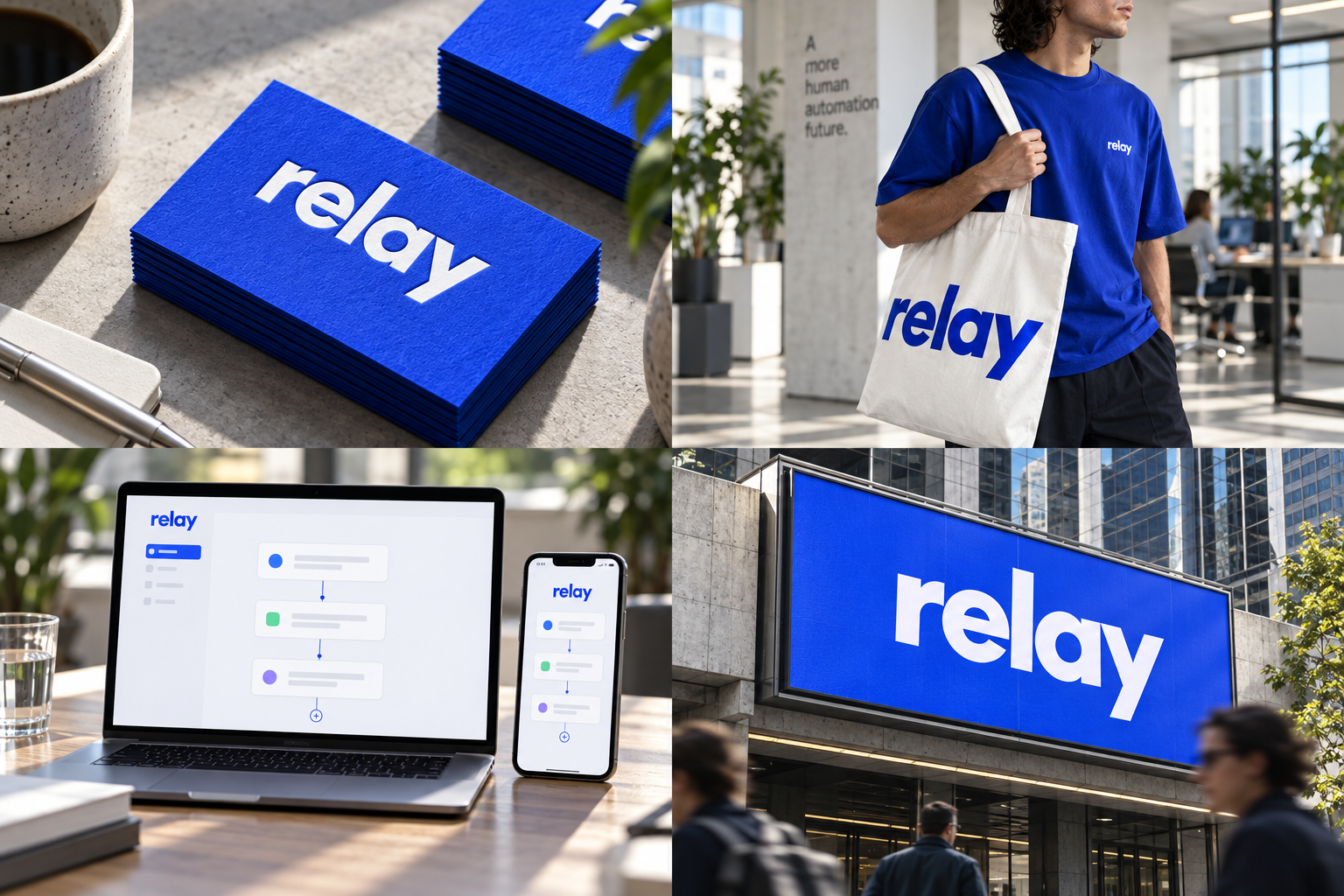
 Cotton card · 600 gsmScreen-printed cottonProduct UI · 16px mark48-sheet billboard
The brand out in the world. For print and production, use the editable vector files.
The idea behind it
A business first.
An identity with purpose.
Relay is a concept brand for a two-person automation studio. Most clients arrive with the same problem: someone copies orders from email into a spreadsheet every morning. Relay connects the tools so that job quietly disappears.
The bold lowercase relay wordmark is the identity's anchor. Its open, geometric letters make a technical service feel direct and approachable, while cobalt gives it a clear presence on cards, clothing and product screens.
The identity system
Everything relay needs to show up the same way, everywhere.
01Primary logo
02Compact mark
03Clear space
04Color system
#2448FFBrand fields and primary actions
#F2F5FFOpen space and product surfaces
#101B38Body text and interface structure
#D7F665Small highlights with dark text
Watch: Blue is common in software. Relay needs consistent wordmark spacing, plain language and confident composition to feel distinctive. Keep lime off white when it carries small text.
05Brand pattern
06Typography
Your tools. Finally talking.
A clear, energetic identity for a company that connects the work between your tools.
- Display · 56pxrelay
- Heading · 30pxrelay
- Body · 16pxrelay
- Caption · 12pxrelay
07Signage
08Stationery
09In use

The voice
Your tools. Finally talking.
Direct. Capable. Human.
In everyday life
Designed to leave the screen.
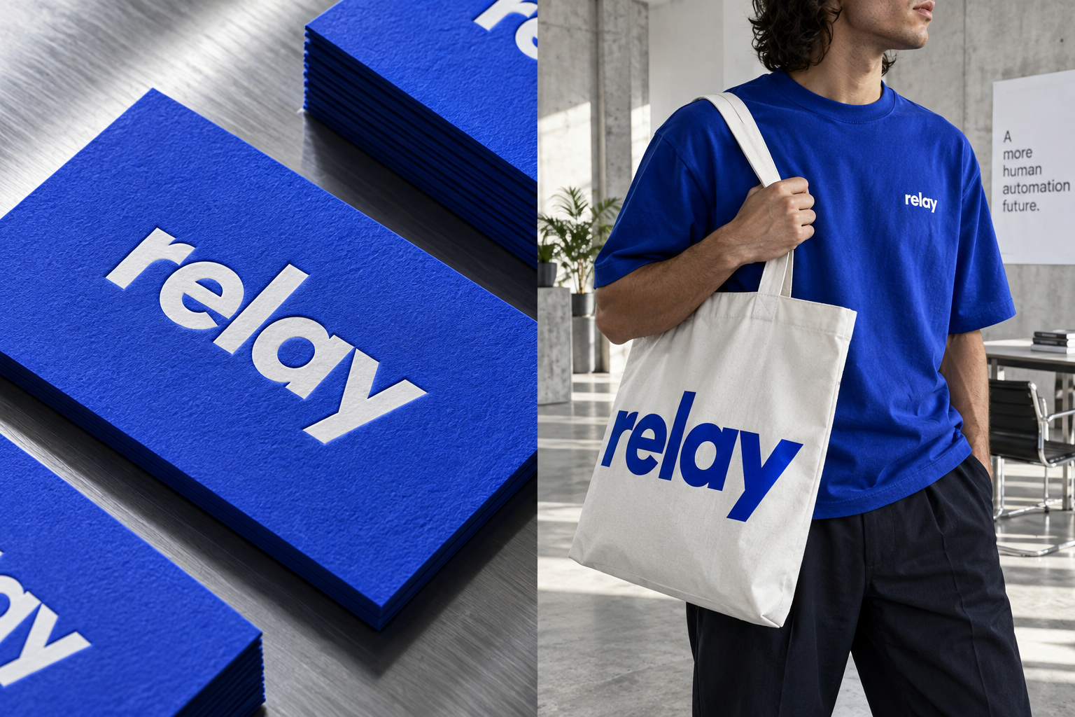
- A cobalt shirt makes a technical service recognizable.
- An ice-white tote lets the wordmark do the work at events.
- Tactile business cards pair a confident color field with very little copy.
Borrow the thinking
What could your
brand take from this?
- 01Build the identity around a specific customer benefit.
- 02Make one accent earn its place in the product.
- 03Check that a wordmark stays clear on a small product screen.
Your next chapter
A starting point.
Ready for your story.
Start from this brief, keep what fits and make it your own. Add your business name and BranDoor shapes everything around you.
Build my brand from this ↗Take the starter assets
Open any file to preview it here; download it when you're ready to use it.
Brief & color palette
- What it is
- An AI workflow automation partner that connects business tools, removes repetitive administration and makes handoffs reliable for growing teams.
- Who it's for
- Founders and operations leads in growing service businesses who need dependable systems without extra complexity.
- Personality
- Keywords
- Avoid
- Palette
- Cobalt
#2448FFIce#F2F5FFMidnight#101B38Signal#D7F665 - Type · Voice
- Geometric sans + monospace details. Direct. Capable. Human.
Mini brand guide
relay — starter guide
The story
Relay is a concept brand for a two-person automation studio. Most clients arrive with the same problem: someone copies orders from email into a spreadsheet every morning. Relay connects the tools so that job quietly disappears.
The wordmark
The bold lowercase relay wordmark is the identity's anchor. Its open, geometric letters make a technical service feel direct and approachable, while cobalt gives it a clear presence on cards, clothing and product screens.
Color
- Cobalt #2448FF — Brand fields and primary actions
- Ice #F2F5FF — Open space and product surfaces
- Midnight #101B38 — Body text and interface structure
- Signal #D7F665 — Small highlights with dark text
Cobalt gives product demos one recognizable anchor. Ice creates room for dense workflows; midnight carries the reading. Lime is a small signal for a completed handoff, never a whole page of competing highlights.
Typography
Geometric sans + monospace details. A bold lowercase wordmark makes a technical service feel approachable. Use a neutral sans for explanations and monospace only for workflow labels and status details.
Voice
Direct. Capable. Human. Example: “Your tools. Finally talking.”
What to borrow
- Build the identity around a specific customer benefit.
- Make one accent earn its place in the product.
- Check that a wordmark stays clear on a small product screen.
Concept brands are open starting points. Add your own name, adapt the artwork and make it yours. The typography is a direction to pair with fonts you choose.