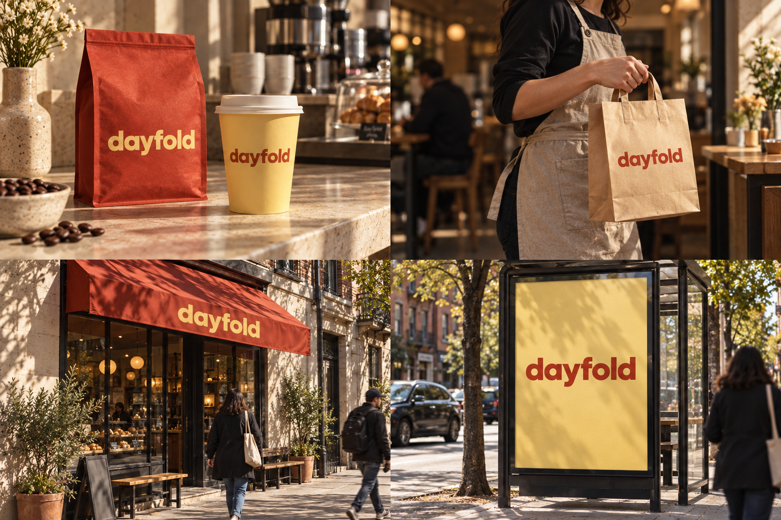
 Roast bag · 250 gKraft takeaway bagPainted fasciaA0 street poster
The brand out in the world. For print and production, use the editable vector files.
The idea behind it
A business first.
An identity with purpose.
Dayfold is a concept brand for a corner coffee shop that opens at 6:30 for commuters and roasts its own beans on Mondays. Regulars' orders are written on cards behind the counter, so the usual is started before you reach the till.
The friendly lowercase dayfold wordmark carries the identity on cups, bags and the cafe counter. Its rounded letters and generous spacing make the name easy to recognize during a quick daily stop.
The identity system
Everything dayfold needs to show up the same way, everywhere.
01Primary logo
02Compact mark
03Clear space
04Color system
#B93720Wordmarks and signature packaging
#F5D976Cups and welcoming color fields
#FFF8E9Menus and quiet backgrounds
#34211BSmall print and essential information
Watch: Too much red and yellow can feel like fast food. Tactile paper, generous spacing and restrained layouts help preserve the neighborhood-roaster character.
05Brand pattern
06Typography
Your usual? It's already going.
A bright neighborhood coffee brand that makes an everyday ritual feel worth slowing down for.
- Display · 56pxdayfold
- Heading · 30pxdayfold
- Body · 16pxdayfold
- Caption · 12pxdayfold
07Signage
08Stationery
09In use

The voice
Your usual? It's already going.
Warm. Bright. Uncomplicated.
In everyday life
Designed to leave the screen.
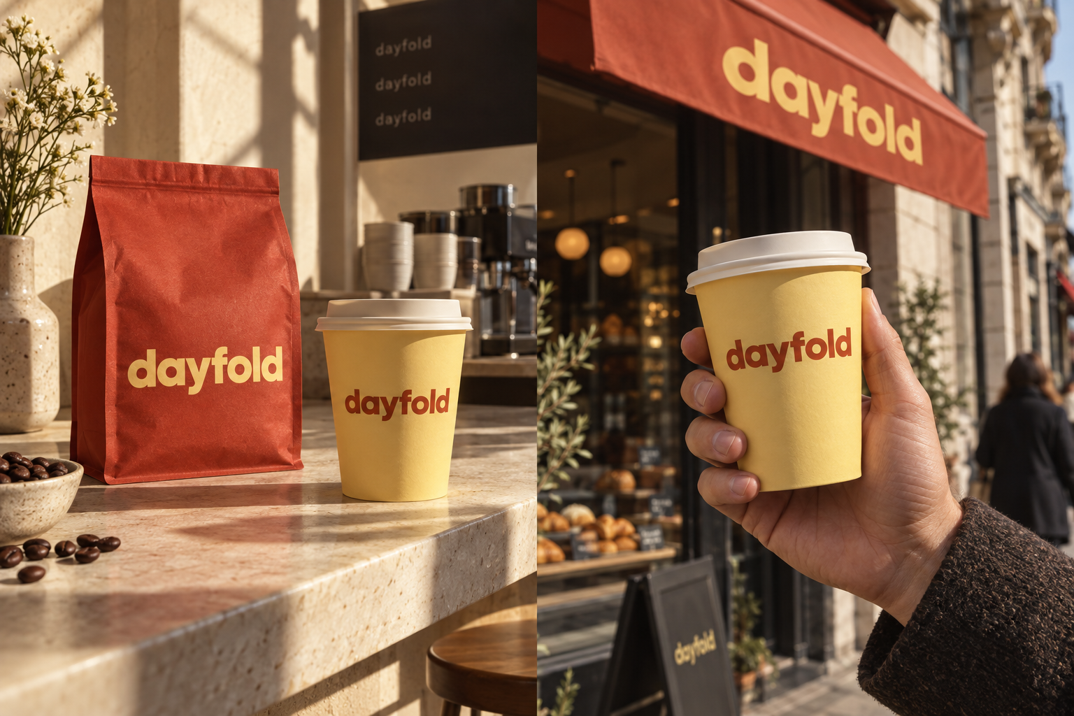
- A yellow takeaway cup becomes a recognizable piece of the neighborhood.
- A vermilion bag gives the retail shelf a strong, simple anchor.
- Morning light and real paper make the identity feel part of a daily ritual.
Borrow the thinking
What could your
brand take from this?
- 01Choose colors for the place the brand will actually be seen.
- 02Try the identity on its smallest everyday object.
- 03Balance playful personality with very clear information.
Your next chapter
A starting point.
Ready for your story.
Start from this brief, keep what fits and make it your own. Add your business name and BranDoor shapes everything around you.
Build my brand from this ↗Take the starter assets
Open any file to preview it here; download it when you're ready to use it.
Brief & color palette
- What it is
- A welcoming neighborhood coffee shop and small-batch roaster that brings care and a bright, uncomplicated personality to everyday coffee rituals.
- Who it's for
- Local residents, commuters and creative workers looking for quality coffee without an intimidating specialty-coffee experience.
- Personality
- Keywords
- Avoid
- Palette
- Vermilion
#B93720Butter#F5D976Cream#FFF8E9Espresso#34211B - Type · Voice
- Rounded sans + straightforward supporting type. Warm. Bright. Uncomplicated.
Mini brand guide
dayfold — starter guide
The story
Dayfold is a concept brand for a corner coffee shop that opens at 6:30 for commuters and roasts its own beans on Mondays. Regulars' orders are written on cards behind the counter, so the usual is started before you reach the till.
The wordmark
The friendly lowercase dayfold wordmark carries the identity on cups, bags and the cafe counter. Its rounded letters and generous spacing make the name easy to recognize during a quick daily stop.
Color
- Vermilion #B93720 — Wordmarks and signature packaging
- Butter #F5D976 — Cups and welcoming color fields
- Cream #FFF8E9 — Menus and quiet backgrounds
- Espresso #34211B — Small print and essential information
Vermilion makes the cup visible on a busy street. Butter yellow adds a sunny counterpoint, while cream gives menus and packaging a quieter surface. Espresso provides a reliable dark for useful information.
Typography
Rounded sans + straightforward supporting type. Generous lowercase letters feel informal and easy to spot across a counter. Keep roast information and prices in simple supporting type; personality should never make a menu hard to read.
Voice
Warm. Bright. Uncomplicated. Example: “Your usual? It's already going.”
What to borrow
- Choose colors for the place the brand will actually be seen.
- Try the identity on its smallest everyday object.
- Balance playful personality with very clear information.
Concept brands are open starting points. Add your own name, adapt the artwork and make it yours. The typography is a direction to pair with fonts you choose.