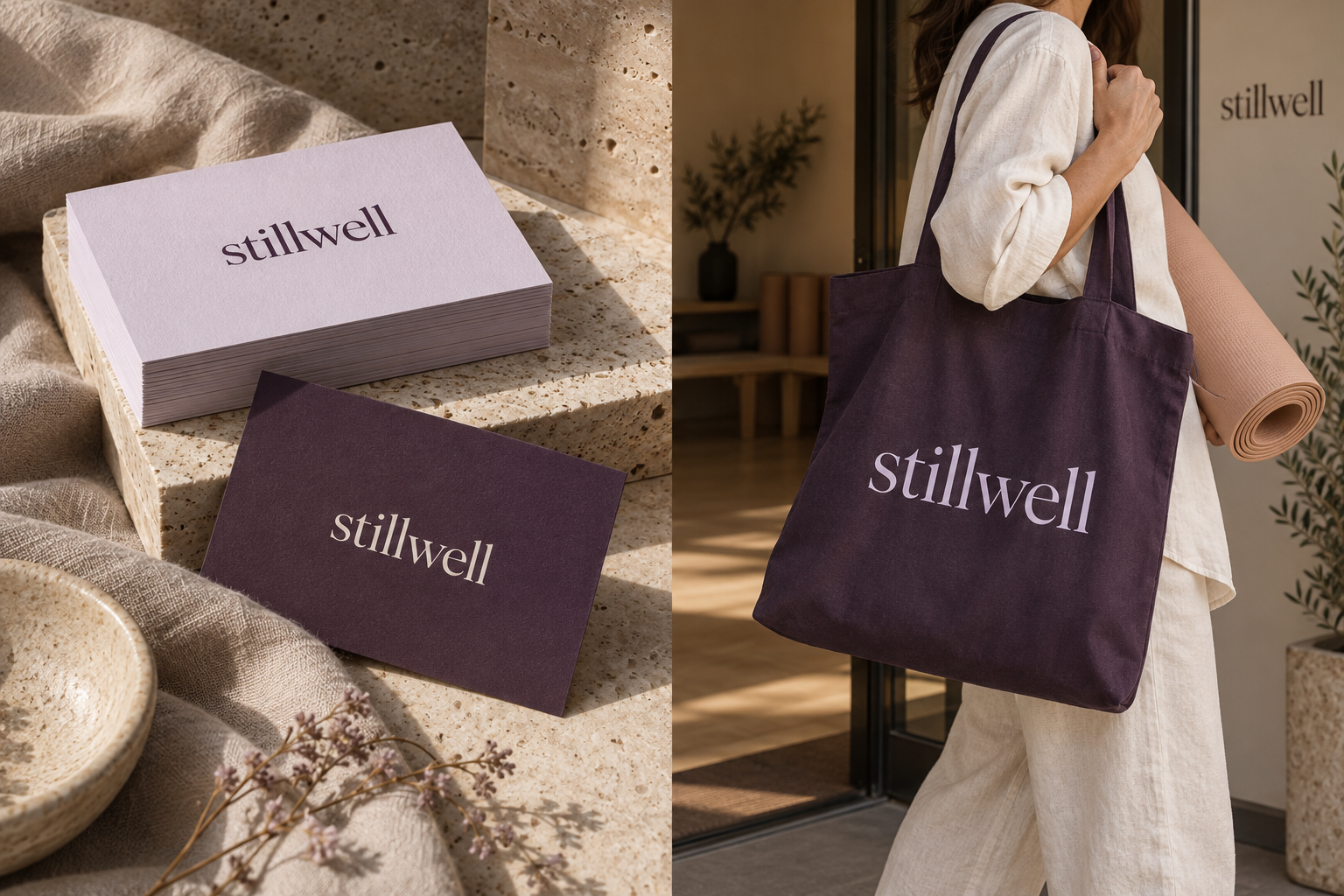
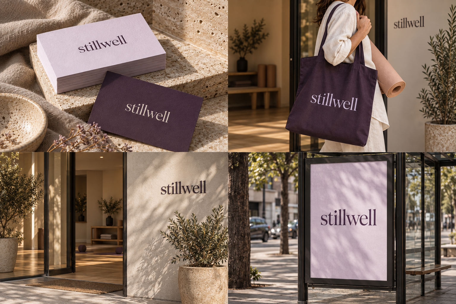
 Appointment card · A7Canvas toteEtched glass doorA1 class poster
The brand out in the world. For print and production, use the editable vector files.
The idea behind it
A business first.
An identity with purpose.
Stillwell is a concept brand for a movement and recovery studio with classes capped at eight people, so the teacher learns everyone's name, and every stiff shoulder, in the first week. Beginners are the majority, not the exception.
The stillwell name is the mark. A quiet editorial serif gives it a personal, considered tone, while generous space around the wordmark suggests the calm and attention offered by the studio.
The identity system
Everything stillwell needs to show up the same way, everywhere.
01Primary logo
02Compact mark
03Clear space
04Color system
#49364DWordmarks, signage and text
#E8DDECCards and soft color fields
#FAF7F2Booking pages and open space
#D7AA92Warm material accents
Watch: Quiet colors can disappear at small sizes. Use aubergine for essential text, and keep lilac and peach as supporting fields rather than low-contrast lettering.
05Brand pattern
06Typography
Come as you are. Leave a little looser.
A considered identity for movement and recovery, with space to breathe and strength beneath the quiet.
- Display · 56pxstillwell
- Heading · 30pxstillwell
- Body · 16pxstillwell
- Caption · 12pxstillwell
07Signage
08Stationery
09In use
The voice
Come as you are. Leave a little looser.
Grounded. Encouraging. Spacious.
In everyday life
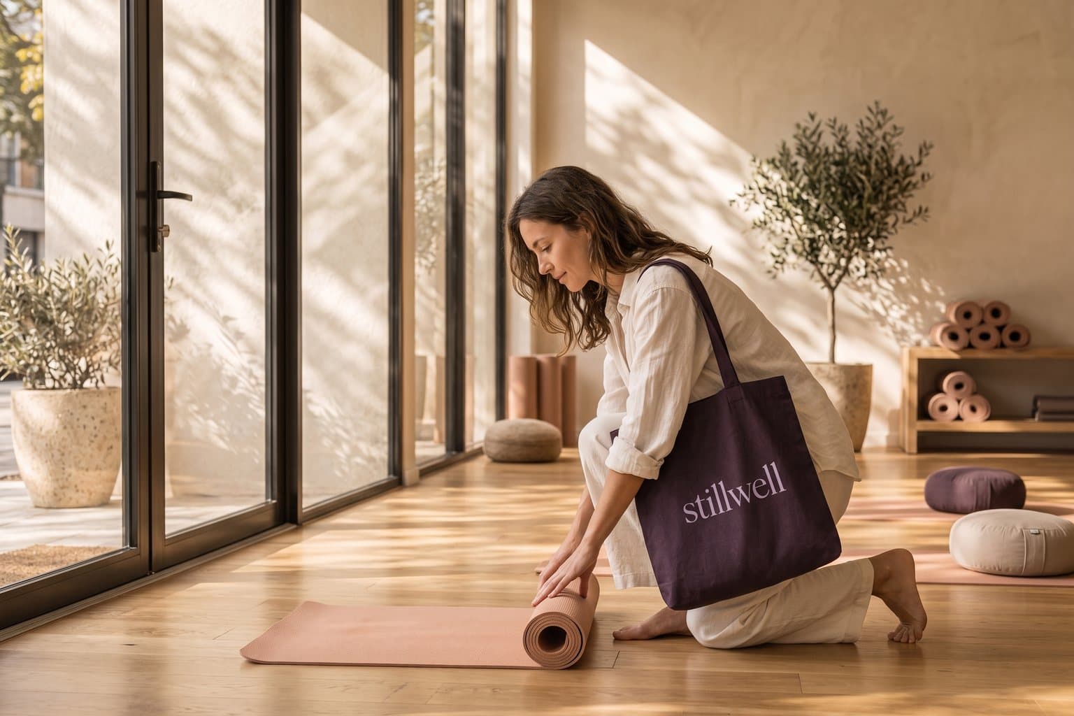
Designed to leave the screen.
- Thick appointment cards make a routine booking feel personal.
- A dark tote carries the identity beyond the studio without shouting.
- Linen, stone and soft light give the palette a tangible setting.
Borrow the thinking
What could your
brand take from this?
- 01A calm brand still needs a strong dark color.
- 02Show the values through materials, not just adjectives.
- 03Give expressive typography a practical supporting partner.
Your next chapter
A starting point.
Ready for your story.
Start from this brief, keep what fits and make it your own. Add your business name and BranDoor shapes everything around you.
Build my brand from this ↗Take the starter assets
Open any file to preview it here; download it when you're ready to use it.
Brief & color palette
- What it is
- A welcoming movement and recovery studio offering guided classes and restorative sessions that help adults build a steady, sustainable wellbeing routine.
- Who it's for
- Busy adults and beginners seeking thoughtful instruction, a welcoming space and consistent progress without performance pressure.
- Personality
- Keywords
- Avoid
- Palette
- Aubergine
#49364DLilac#E8DDECChalk#FAF7F2Clay#D7AA92 - Type · Voice
- Editorial serif + neutral sans. Grounded. Encouraging. Spacious.
Mini brand guide
stillwell — starter guide
The story
Stillwell is a concept brand for a movement and recovery studio with classes capped at eight people, so the teacher learns everyone's name, and every stiff shoulder, in the first week. Beginners are the majority, not the exception.
The wordmark
The stillwell name is the mark. A quiet editorial serif gives it a personal, considered tone, while generous space around the wordmark suggests the calm and attention offered by the studio.
Color
- Aubergine #49364D — Wordmarks, signage and text
- Lilac #E8DDEC — Cards and soft color fields
- Chalk #FAF7F2 — Booking pages and open space
- Clay #D7AA92 — Warm material accents
Aubergine gives the identity depth to stand apart from the usual sage wellness palette. Lilac and chalk create light surfaces; muted peach brings warmth into materials and photography without dominating them.
Typography
Editorial serif + neutral sans. A serif wordmark gives the studio a considered, personal character. A simple sans keeps class schedules, pricing and booking instructions comfortable to scan.
Voice
Grounded. Encouraging. Spacious. Example: “Come as you are. Leave a little looser.”
What to borrow
- A calm brand still needs a strong dark color.
- Show the values through materials, not just adjectives.
- Give expressive typography a practical supporting partner.
Concept brands are open starting points. Add your own name, adapt the artwork and make it yours. The typography is a direction to pair with fonts you choose.