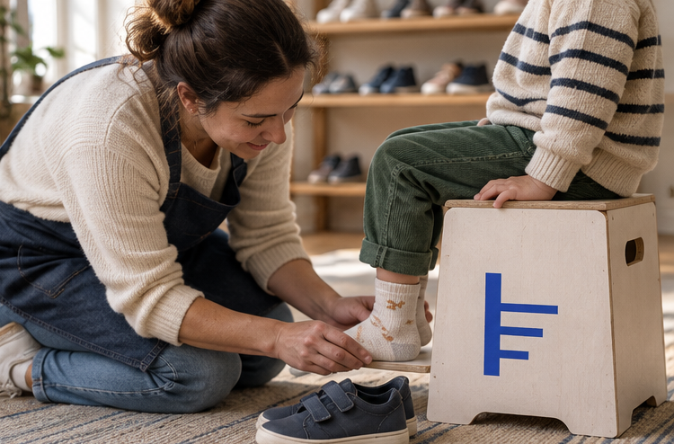
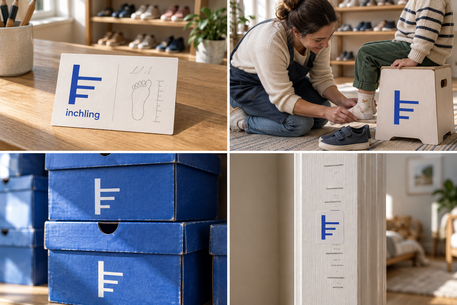
 Measuring card · sizes 4–13Fitting · both feetShoebox · size 9Height chart decal
The brand out in the world. For print and production, use the editable vector files.
The idea behind it
A business first.
An identity with purpose.
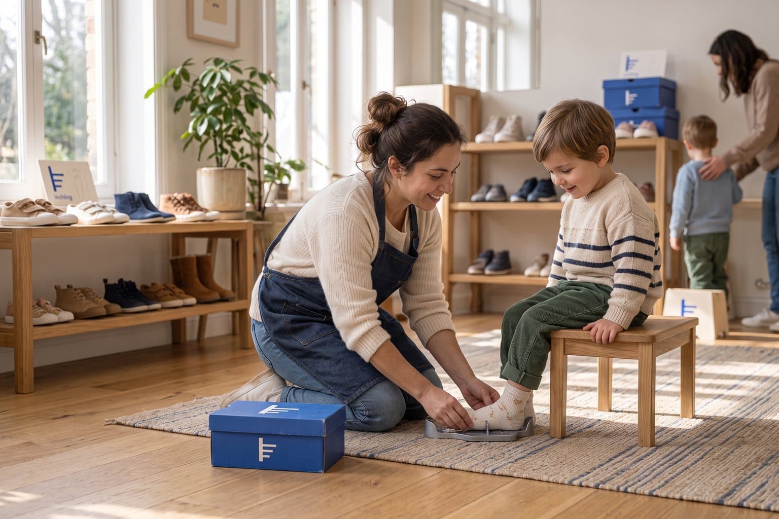
Inchling is a concept brand for a children's shoe shop where every pair starts with measuring both feet, length and width. Parents get a card with the date and size, and a reminder when it is time to measure again. Nobody leaves with shoes 'to grow into'.
Most families have a doorframe with pencil lines on it, one for each birthday. Inchling's symbol is that doorframe: an upright edge with three marks, each a little higher and longer than the last. Parents recognize it immediately, and it says what the shop is really about: feet that grow.
The identity system
Everything inchling needs to show up the same way, everywhere.
01Primary logo
02Logo mark alone
03Clear space
04Color system
#2B66C9Symbol, shoe boxes and signage
#FFF8ECMeasuring cards and backgrounds
#F6C945New-size highlights
#A9CDEBSecondary packaging fields
Watch: Three lines on a post can look like a ruler or a coat hook at a glance. Show the symbol beside a real measuring moment early on, and the doorframe reading takes over.
05Brand pattern
06Typography
Up half a size since spring. Well done, feet.
A children's shoe shop whose symbol is the pencil marks families make on a doorframe.
- Display · 56pxinchling
- Heading · 30pxinchling
- Body · 16pxinchling
- Caption · 12pxinchling
07Signage
08Stationery
09In use
The voice
Up half a size since spring. Well done, feet.
Kind and practical, like a good teacher at pick-up time.
In everyday life
Designed to leave the screen.
- A measuring card with the date, size and doorframe marks.
- The symbol on the side of each shoe box.
- A growth chart sticker for the bedroom door.
Borrow the thinking
What could your
brand take from this?
- 01Find the ritual families already have.
- 02A symbol can show change over time.
- 03Make the most-read object, here a measuring card, the best-designed one.
Your next chapter
A starting point.
Ready for your story.
Start from this brief, keep what fits and make it your own. Add your business name and BranDoor shapes everything around you.
Build my brand from this ↗Take the starter assets
Open any file to preview it here; download it when you're ready to use it.
Editable symbol

Brief & color palette
- What it is
- A children's shoe shop that measures every child's feet properly and reminds parents when to come back, with a symbol drawn from height marks on a doorframe.
- Who it's for
- Parents of babies to ten-year-olds who want shoes that fit properly and a shop visit that does not end in tears.
- Personality
- Keywords
- Avoid
- Palette
- Crayon blue
#2B66C9Chalk#FFF8ECPencil yellow#F6C945Sky#A9CDEB - Type · Voice
- Friendly rounded sans + clear numerals. Kind and practical, like a good teacher at pick-up time.
Mini brand guide
inchling — starter guide
The story
Inchling is a concept brand for a children's shoe shop where every pair starts with measuring both feet, length and width. Parents get a card with the date and size, and a reminder when it is time to measure again. Nobody leaves with shoes 'to grow into'.
The symbol
Most families have a doorframe with pencil lines on it, one for each birthday. Inchling's symbol is that doorframe: an upright edge with three marks, each a little higher and longer than the last. Parents recognize it immediately, and it says what the shop is really about: feet that grow.
Color
- Crayon blue #2B66C9 — Symbol, shoe boxes and signage
- Chalk #FFF8EC — Measuring cards and backgrounds
- Pencil yellow #F6C945 — New-size highlights
- Sky #A9CDEB — Secondary packaging fields
Crayon blue is bright enough for children and serious enough for parents. Chalk keeps cards light, pencil yellow marks each new measurement and sky is a soft secondary field.
Typography
Friendly rounded sans + clear numerals. Rounded letters feel kind to small customers without turning babyish. Sizes and dates use clear, tabular numerals, because the measuring card is the most-read thing the shop makes.
Voice
Kind and practical, like a good teacher at pick-up time. Example: “Up half a size since spring. Well done, feet.”
What to borrow
- Find the ritual families already have.
- A symbol can show change over time.
- Make the most-read object, here a measuring card, the best-designed one.
Concept brands are open starting points. Add your own name, adapt the artwork and make it yours. The typography is a direction to pair with fonts you choose.