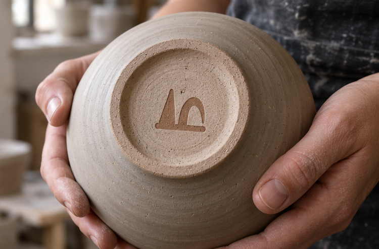
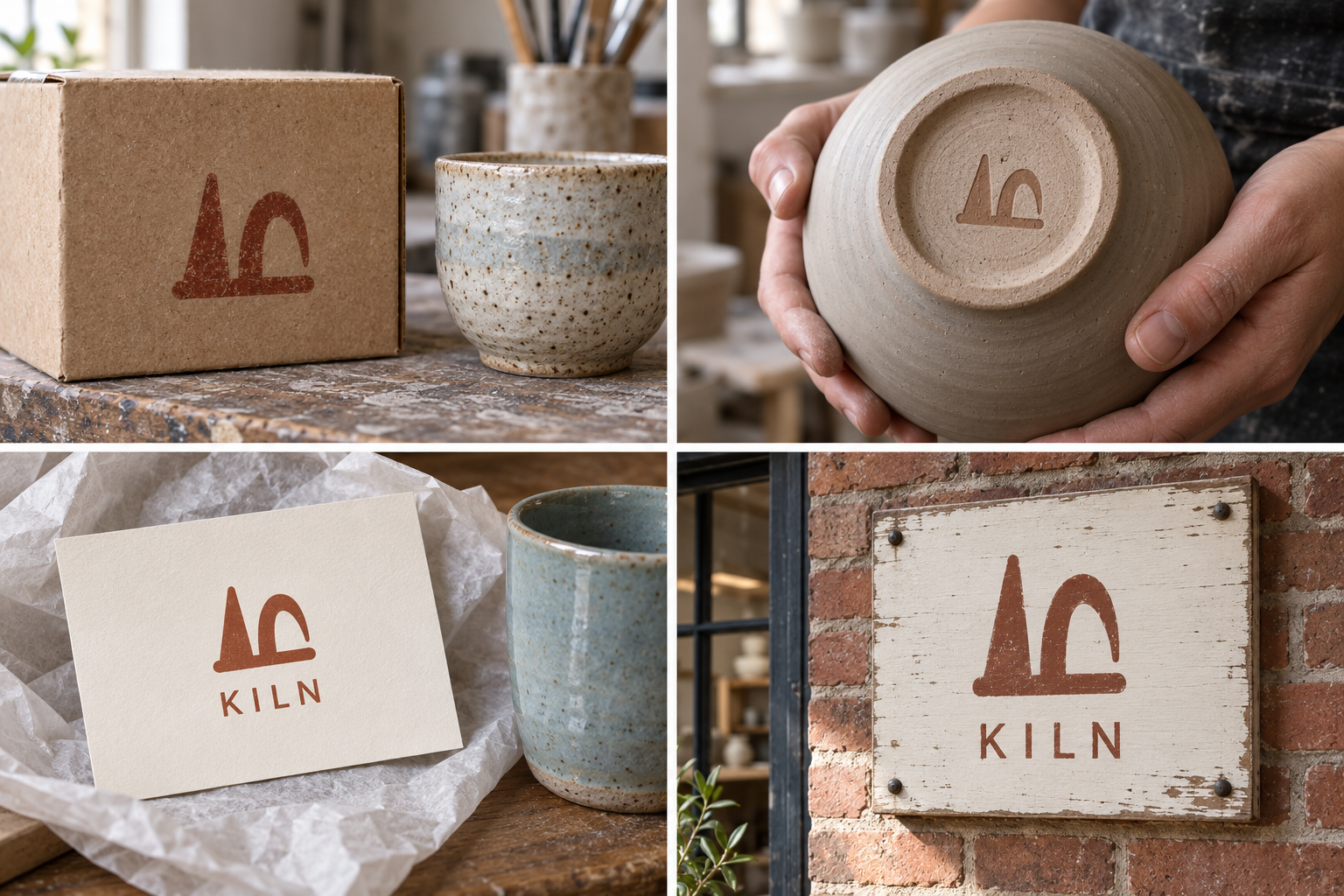
 Kraft box · rubber stampMaker’s mark · stamped clayCare card · dishwasher safePainted workshop sign
The brand out in the world. For print and production, use the editable vector files.
The idea behind it
A business first.
An identity with purpose.
Kiln is a concept brand for a two-person ceramics workshop making cups, bowls and plates in small batches. The kiln is fired every Thursday; whatever comes out on Friday goes on the shelf that weekend.
Potters place small clay cones inside the kiln. When it reaches the right heat, the cone bends over. That bow is how a potter knows the firing worked. The symbol shows one cone still standing and one bent: a detail every potter knows, and a quiet promise that each piece was fired properly.
The identity system
Everything KILN needs to show up the same way, everywhere.
01Primary logo
02Logo mark alone
03Clear space
04Color system
#944329Maker's mark and wrapping
#F7EBDCLabels and product backgrounds
#342E2BType and care instructions
#9DB9C0Seasonal accents
Watch: Non-potters will not know what a kiln cone is. That is an opening, not a problem: tell the story once, on the care card, and buyers will repeat it.
05Brand pattern
06Typography
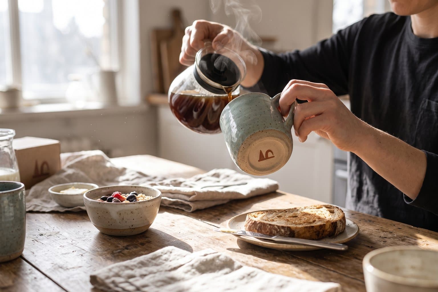
Good for your morning coffee. Fine in the dishwasher.
A small ceramics workshop whose symbol is the clay cone potters use to check a firing.
- Display · 56pxKILN
- Heading · 30pxKILN
- Body · 16pxKILN
- Caption · 12pxKILN
07Signage
08Stationery
09In use
The voice
Good for your morning coffee. Fine in the dishwasher.
Plain and warm, the way a maker explains their work at the market stall.
In everyday life
Designed to leave the screen.
- The bent cone stamped into the foot of every bowl.
- A rubber stamp on tissue paper and kraft boxes.
- A care card that explains the cone in two sentences.
Borrow the thinking
What could your
brand take from this?
- 01Look for the tool or test only insiders know.
- 02A symbol can carry a promise: here, 'fired properly'.
- 03Let the care card tell the story the mark starts.
Your next chapter
A starting point.
Ready for your story.
Start from this brief, keep what fits and make it your own. Add your business name and BranDoor shapes everything around you.
Build my brand from this ↗Take the starter assets
Open any file to preview it here; download it when you're ready to use it.
Editable symbol

Brief & color palette
- What it is
- A small ceramics workshop making everyday cups, bowls and plates, fired weekly, with a symbol taken from the clay cones potters use to check a firing.
- Who it's for
- People who want useful, handmade tableware for daily use and like knowing how it was made.
- Personality
- Keywords
- Avoid
- Palette
- Oxide
#944329Porcelain#F7EBDCSoot#342E2BGlaze#9DB9C0 - Type · Voice
- Warm serif + workmanlike sans. Plain and warm, the way a maker explains their work at the market stall.
Mini brand guide
KILN — starter guide
The story
Kiln is a concept brand for a two-person ceramics workshop making cups, bowls and plates in small batches. The kiln is fired every Thursday; whatever comes out on Friday goes on the shelf that weekend.
The symbol
Potters place small clay cones inside the kiln. When it reaches the right heat, the cone bends over. That bow is how a potter knows the firing worked. The symbol shows one cone still standing and one bent: a detail every potter knows, and a quiet promise that each piece was fired properly.
Color
- Oxide #944329 — Maker's mark and wrapping
- Porcelain #F7EBDC — Labels and product backgrounds
- Soot #342E2B — Type and care instructions
- Glaze #9DB9C0 — Seasonal accents
Oxide is the color of fired iron-rich clay. Porcelain is a light ground, soot is for text and glaze blue adds one cool note for seasonal batches.
Typography
Warm serif + workmanlike sans. A warm serif suits the short stories on care cards. A plain sans handles sizes, glaze names and the 'dishwasher safe' line.
Voice
Plain and warm, the way a maker explains their work at the market stall. Example: “Good for your morning coffee. Fine in the dishwasher.”
What to borrow
- Look for the tool or test only insiders know.
- A symbol can carry a promise: here, 'fired properly'.
- Let the care card tell the story the mark starts.
Concept brands are open starting points. Add your own name, adapt the artwork and make it yours. The typography is a direction to pair with fonts you choose.