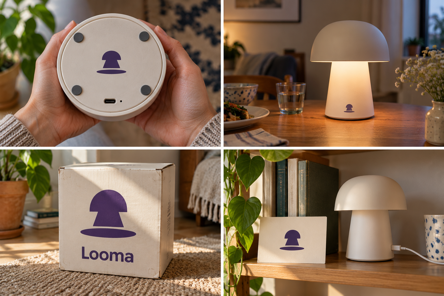
 Base label · laser etchedTable lamp · 2700 KRigid lamp boxCharging guide card
The brand out in the world. For print and production, use the editable vector files.
The idea behind it
A business first.
An identity with purpose.
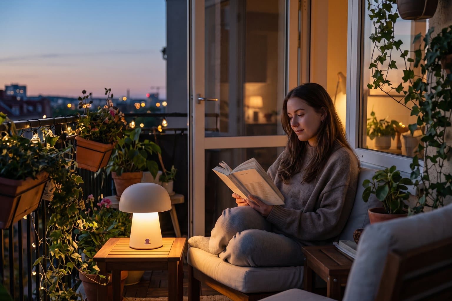
Looma is a concept brand for a maker of rechargeable table lamps for small apartments: no cable, one charge lasts a week of evenings. People carry them from the desk to the dinner table to the balcony.
A good lamp isn't really about the lamp. It is about the circle of light it throws on the table, where the conversation or the book carries on. The symbol is a shade, its light and the pool underneath, with the pool given as much weight as the lamp itself.
The identity system
Everything Looma needs to show up the same way, everywhere.
01Primary logo
02Logo mark alone
03Clear space
04Color system
#49306BMain symbol and readable text
#FFF3DBLight surfaces
#F3B94DWarm highlights
#C5B3DCSecondary packaging fields
Watch: A lamp shape can look like a mushroom or a bell at small sizes. The pool of light underneath is what makes it read as a lamp, so never crop it off.
05Brand pattern
06Typography
Charge it once. Carry it to wherever the evening goes.
Rechargeable lamps for small homes, marked by the circle of light where people end up staying.
- Display · 56pxLooma
- Heading · 30pxLooma
- Body · 16pxLooma
- Caption · 12pxLooma
07Signage
08Stationery
09In use
The voice
Charge it once. Carry it to wherever the evening goes.
Warm and low-key, like the evening it is made for.
In everyday life
Designed to leave the screen.
- The symbol printed under the base of each lamp.
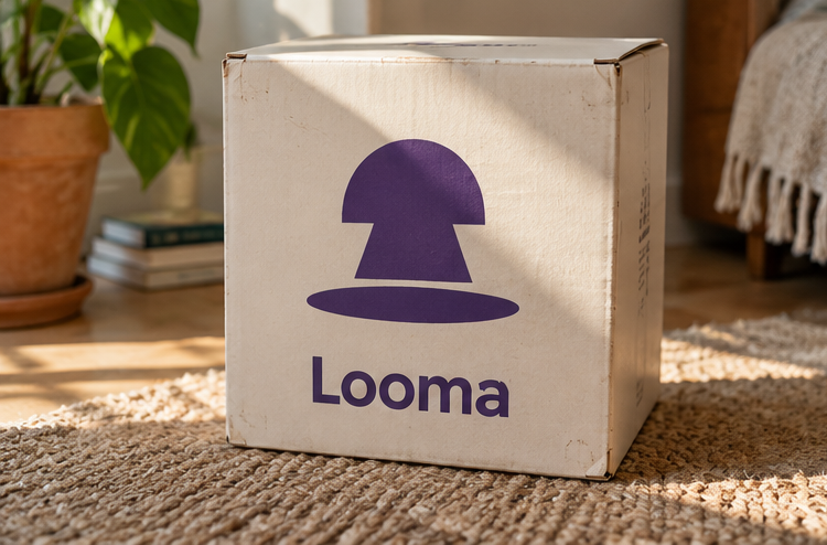
- A milk-white box with the light pool drawn large.
- A charging card: 'Full in 4 hours. Lasts a week of evenings.'
Borrow the thinking
What could your
brand take from this?
- 01Show what the product does, not just what it is.
- 02Give the effect as much weight as the object.
- 03Use numbers customers care about, like hours of light.
Your next chapter
A starting point.
Ready for your story.
Start from this brief, keep what fits and make it your own. Add your business name and BranDoor shapes everything around you.
Build my brand from this ↗Take the starter assets
Open any file to preview it here; download it when you're ready to use it.
Editable symbol

Brief & color palette
- What it is
- Rechargeable cordless table lamps for small homes, with a symbol built around the pool of light a lamp throws on the table.
- Who it's for
- People in small apartments who want warm, movable light for reading, dinners and balconies.
- Personality
- Keywords
- Avoid
- Palette
- Ink violet
#49306BMilk#FFF3DBAmber#F3B94DDusk#C5B3DC - Type · Voice
- Soft geometric sans + neutral text face. Warm and low-key, like the evening it is made for.
Mini brand guide
Looma — starter guide
The story
Looma is a concept brand for a maker of rechargeable table lamps for small apartments: no cable, one charge lasts a week of evenings. People carry them from the desk to the dinner table to the balcony.
The symbol
A good lamp isn't really about the lamp. It is about the circle of light it throws on the table, where the conversation or the book carries on. The symbol is a shade, its light and the pool underneath, with the pool given as much weight as the lamp itself.
Color
- Ink violet #49306B — Main symbol and readable text
- Milk #FFF3DB — Light surfaces
- Amber #F3B94D — Warm highlights
- Dusk #C5B3DC — Secondary packaging fields
Ink violet is the color of a room after sunset. Milk keeps packaging light, amber is the warm light itself and dusk supports secondary fields.
Typography
Soft geometric sans + neutral text face. Round letters echo the dome of the shade. Battery life, brightness and charging details use a neutral face with tabular numbers.
Voice
Warm and low-key, like the evening it is made for. Example: “Charge it once. Carry it to wherever the evening goes.”
What to borrow
- Show what the product does, not just what it is.
- Give the effect as much weight as the object.
- Use numbers customers care about, like hours of light.
Concept brands are open starting points. Add your own name, adapt the artwork and make it yours. The typography is a direction to pair with fonts you choose.