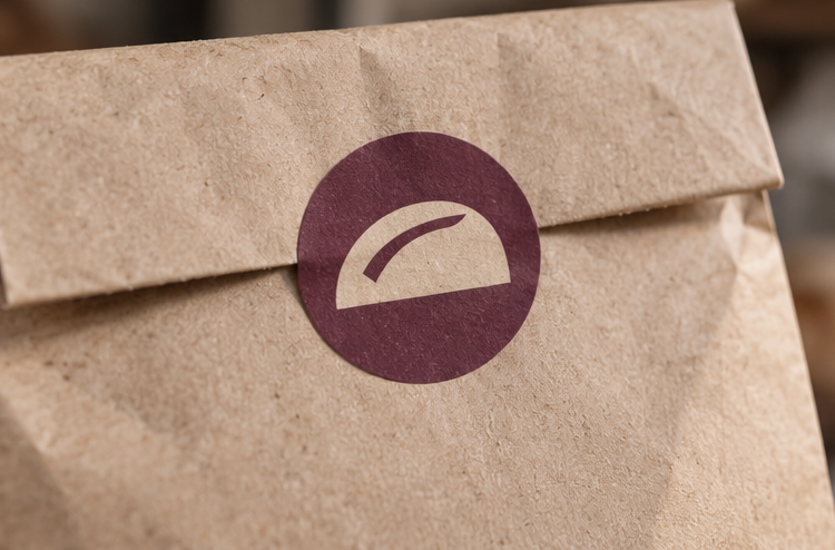
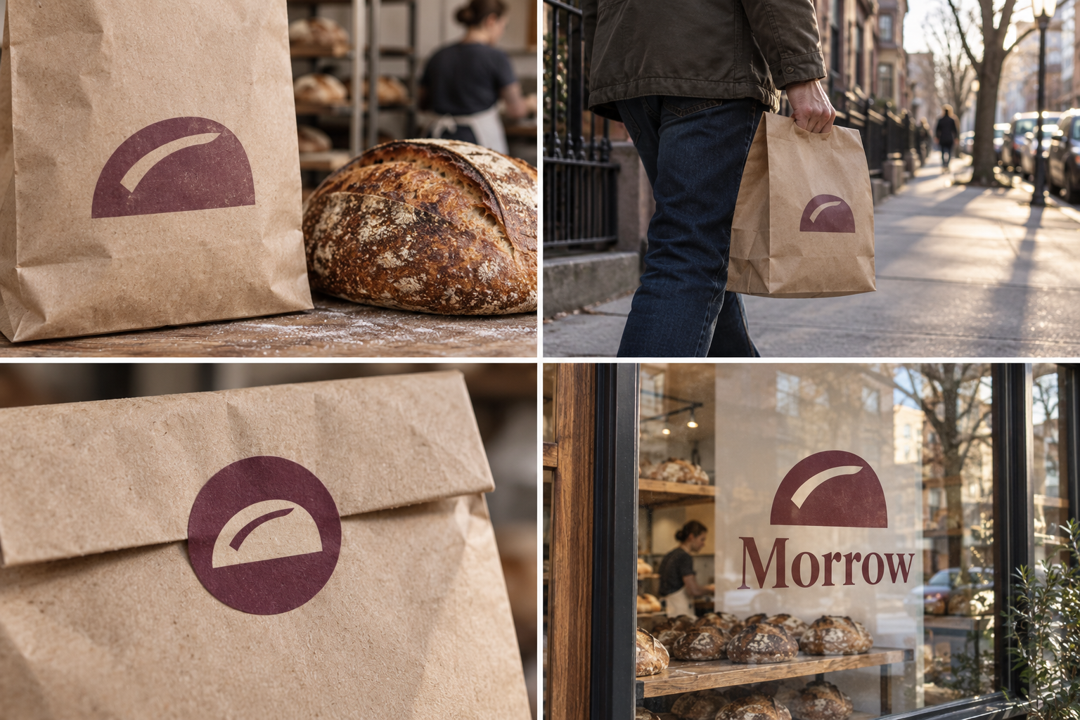
 Bread bag · 800 g loafFresh at 7amBag seal stickerGold-leaf window
The brand out in the world. For print and production, use the editable vector files.
The idea behind it
A business first.
An identity with purpose.
Morrow is a concept brand for a neighborhood bakery. The dough is mixed in the evening and rests overnight; the bread comes out at 7am. There are four loaves on the menu and they rarely change.
Before a loaf goes in the oven, the baker makes one quick cut across the top. In the heat it opens into a ridge that bakers call the ear. Morrow's symbol is a loaf with that one score, sitting on its flat base. Look again and it is also a sun coming up: bread made today, for tomorrow.
The identity system
Everything Morrow needs to show up the same way, everywhere.
01Primary logo
02Logo mark alone
03Clear space
04Color system
#683444Symbol and signature bags
#FFF2DFLabels and backgrounds
#D89D61Warm supporting fields
#A7B9D6Pantry range accents
Watch: A dome shape can read as a hat at a glance. The score is what makes it bread; keep it bold and never drop it.
05Brand pattern
06Typography
Bread's out at 7. Bring your bag.
A neighborhood bakery with overnight bread and a symbol drawn from the baker's cut.
- Display · 56pxMorrow
- Heading · 30pxMorrow
- Body · 16pxMorrow
- Caption · 12pxMorrow
07Signage
08Stationery
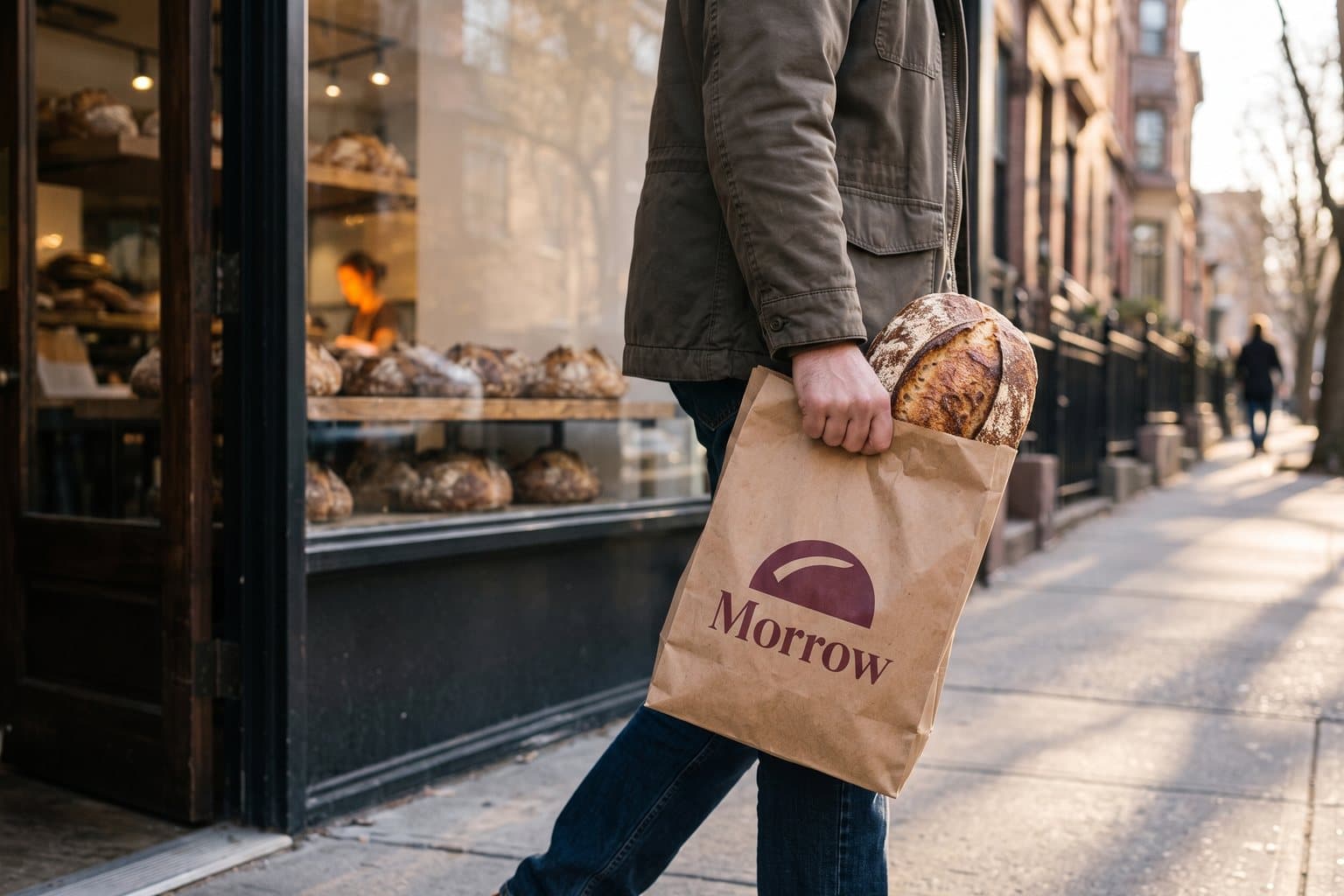
09In use
The voice
Bread's out at 7. Bring your bag.
Friendly, early and to the point, like the person behind the counter at 7am.
In everyday life
Designed to leave the screen.
- The score stamped in mulberry on a paper bread bag.
- A chalkboard menu: four loaves, out at 7.
- A sticker that seals each bag.
Borrow the thinking
What could your
brand take from this?
- 01A process step can become the symbol.
- 02A second reading (loaf and sunrise) should come from the story, not be forced.
- 03Keep the menu as simple as the mark.
Your next chapter
A starting point.
Ready for your story.
Start from this brief, keep what fits and make it your own. Add your business name and BranDoor shapes everything around you.
Build my brand from this ↗Take the starter assets
Open any file to preview it here; download it when you're ready to use it.
Editable symbol

Brief & color palette
- What it is
- A neighborhood bakery with overnight-fermented bread out at 7am every day, with a symbol of a scored loaf that also reads as a rising sun.
- Who it's for
- Local households who buy bread several times a week and want it good, simple and dependable.
- Personality
- Keywords
- Avoid
- Palette
- Mulberry
#683444Flour#FFF2DFCrust#D89D61Cornflower#A7B9D6 - Type · Voice
- Sturdy serif + clear grocery-style sans. Friendly, early and to the point, like the person behind the counter at 7am.
Mini brand guide
Morrow — starter guide
The story
Morrow is a concept brand for a neighborhood bakery. The dough is mixed in the evening and rests overnight; the bread comes out at 7am. There are four loaves on the menu and they rarely change.
The symbol
Before a loaf goes in the oven, the baker makes one quick cut across the top. In the heat it opens into a ridge that bakers call the ear. Morrow's symbol is a loaf with that one score, sitting on its flat base. Look again and it is also a sun coming up: bread made today, for tomorrow.
Color
- Mulberry #683444 — Symbol and signature bags
- Flour #FFF2DF — Labels and backgrounds
- Crust #D89D61 — Warm supporting fields
- Cornflower #A7B9D6 — Pantry range accents
Mulberry is a confident color for bags and stamps that most bakeries do not use. Flour and crust are the bread itself, and cornflower marks the small pantry range.
Typography
Sturdy serif + clear grocery-style sans. A sturdy serif feels like everyday bread, not a patisserie. Loaf names, prices and ingredients use a plain sans for the chalkboard and bag labels.
Voice
Friendly, early and to the point, like the person behind the counter at 7am. Example: “Bread's out at 7. Bring your bag.”
What to borrow
- A process step can become the symbol.
- A second reading (loaf and sunrise) should come from the story, not be forced.
- Keep the menu as simple as the mark.
Concept brands are open starting points. Add your own name, adapt the artwork and make it yours. The typography is a direction to pair with fonts you choose.