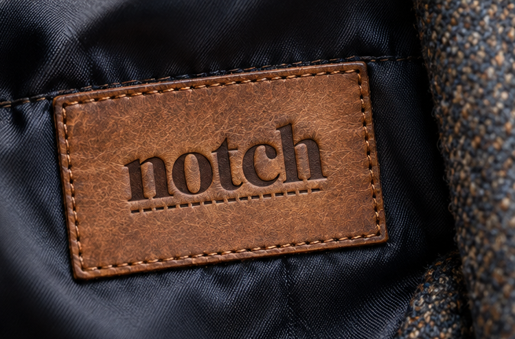
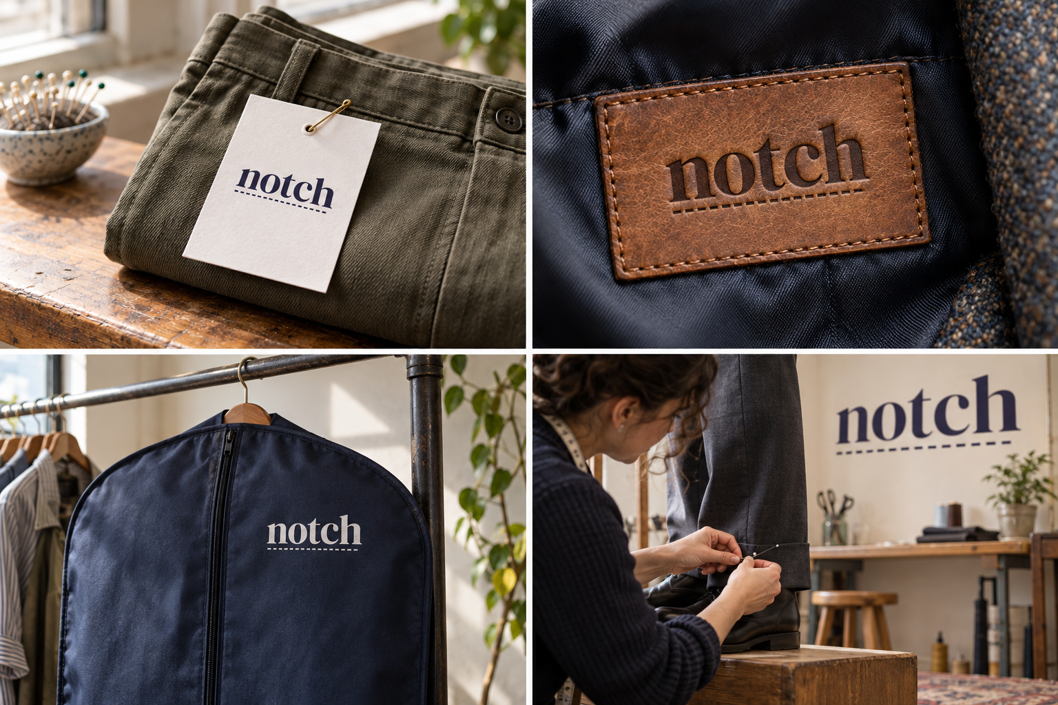
 Collection ticket · ThuChalk mark · fittingBreathable garment bagEmbossed leather tag
The brand out in the world. For print and production, use the editable vector files.
The idea behind it
A business first.
An identity with purpose.
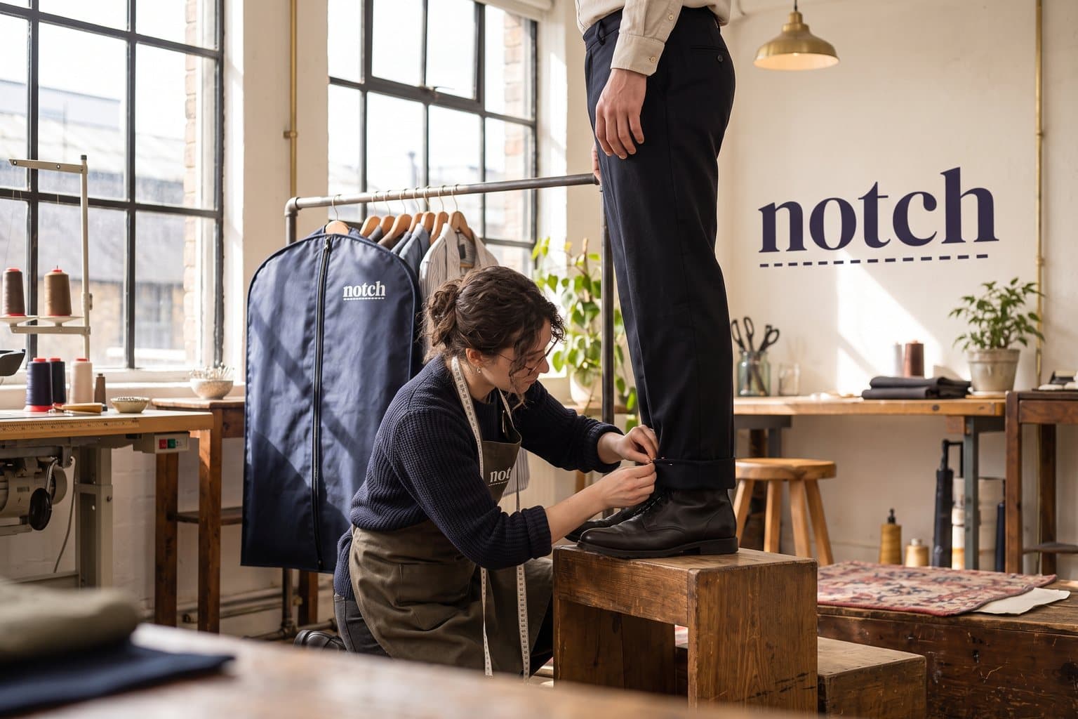
Notch is a concept brand for an alterations studio above a high-street shop. Most of the work is ordinary: hems taken up, waists let out, a favourite coat given another ten years. Fittings take fifteen minutes and every garment goes home with a ticket saying what was changed.
Before two pieces of fabric are sewn together, a tailor snips a small V into the edge of each one. When the notches meet, the pieces line up. The logo is the name itself, set in a sharp display serif, with that V snipped into the shoulder of the n and a row of stitches running underneath. The detail is small enough to keep the word easy to read and specific enough that anyone who has sewn will smile at it.
The identity system
Everything Notch needs to show up the same way, everywhere.
01Primary logo
02Compact mark
03Clear space
04Color system
#2D2A4AWordmark, tickets and garment bags
#F5F1E8Labels and light surfaces
#C23B3BAlteration marks and small details
#E2B75CPackaging accents
Watch: At small sizes the notch closes up and the logo reads as a plain word. That is fine: keep the wordmark at least 24 px tall where the detail matters, and let the stitch line carry the idea on small labels.
05Brand pattern
06Typography
Two centimetres off the hem. Ready on Thursday.
An alterations studio whose name is the logo, with the small cut tailors use to line up fabric snipped into its first letter.
- Display · 56pxNotch
- Heading · 30pxNotch
- Body · 16pxNotch
- Caption · 12pxNotch
07Signage
08Stationery
09In use
The voice
Two centimetres off the hem. Ready on Thursday.
Calm and exact, like a fitting with someone who has done it a thousand times.
In everyday life
Designed to leave the screen.
- The wordmark printed on every collection ticket.
- A garment bag with the notched name at the shoulder.
- A leather tag pressed with the name and stitch line.
Borrow the thinking
What could your
brand take from this?
- 01One small cut can turn a plain name into a logo.
- 02A detail drawn from the trade should still read as a word for everyone else.
- 03Put the brand where the customer reads proof of the work: on the ticket.
Your next chapter
A starting point.
Ready for your story.
Start from this brief, keep what fits and make it your own. Add your business name and BranDoor shapes everything around you.
Build my brand from this ↗Take the starter assets
Open any file to preview it here; download it when you're ready to use it.
Editable wordmark

Brief & color palette
- What it is
- A friendly alterations and repair studio for everyday clothes, with quick fittings and a wordmark that has the notch tailors cut to line up fabric snipped into its n.
- Who it's for
- People who want clothes they already own to fit better and last longer, without the formality of a bespoke tailor.
- Personality
- Keywords
- Avoid
- Palette
- Pinstripe
#2D2A4AChalk#F5F1E8Thread red#C23B3BLining gold#E2B75C - Type · Voice
- High-contrast display serif + plain sans for tickets. Calm and exact, like a fitting with someone who has done it a thousand times.
Mini brand guide
Notch — starter guide
The story
Notch is a concept brand for an alterations studio above a high-street shop. Most of the work is ordinary: hems taken up, waists let out, a favourite coat given another ten years. Fittings take fifteen minutes and every garment goes home with a ticket saying what was changed.
The wordmark
Before two pieces of fabric are sewn together, a tailor snips a small V into the edge of each one. When the notches meet, the pieces line up. The logo is the name itself, set in a sharp display serif, with that V snipped into the shoulder of the n and a row of stitches running underneath. The detail is small enough to keep the word easy to read and specific enough that anyone who has sewn will smile at it.
Color
- Pinstripe #2D2A4A — Wordmark, tickets and garment bags
- Chalk #F5F1E8 — Labels and light surfaces
- Thread red #C23B3B — Alteration marks and small details
- Lining gold #E2B75C — Packaging accents
Pinstripe is a deep suiting color that keeps the wordmark sharp on tickets and bags. Chalk is the tailor's chalk itself, thread red marks what has been altered and lining gold is a small accent inside packaging.
Typography
High-contrast display serif + plain sans for tickets. The wordmark uses a high-contrast display serif, with the precision of a good tailor's label. Fitting notes, prices and collection dates stay in a plain sans, because they are read at the counter in a hurry.
Voice
Calm and exact, like a fitting with someone who has done it a thousand times. Example: “Two centimetres off the hem. Ready on Thursday.”
What to borrow
- One small cut can turn a plain name into a logo.
- A detail drawn from the trade should still read as a word for everyone else.
- Put the brand where the customer reads proof of the work: on the ticket.
Concept brands are open starting points. Add your own name, adapt the artwork and make it yours. The typography is a direction to pair with fonts you choose.