
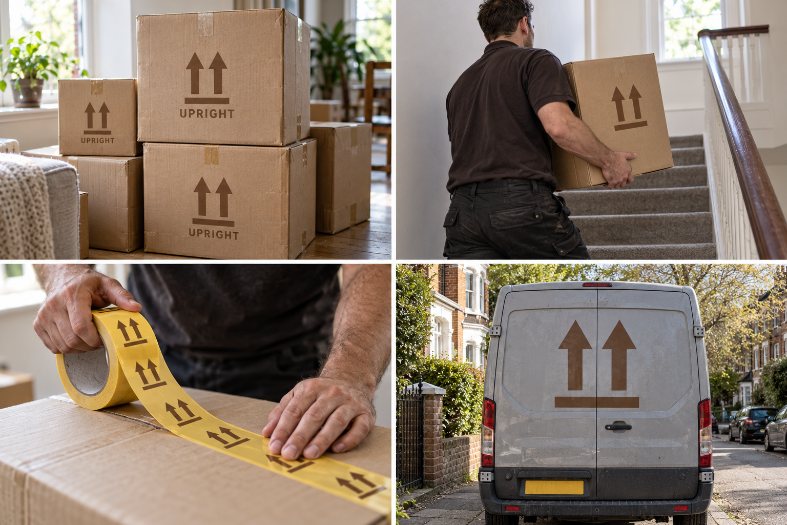
 Large box · 60 LMoving day · 2 moversPrinted tape · 48 mmVan livery
The brand out in the world. For print and production, use the editable vector files.
The idea behind it
A business first.
An identity with purpose.
Upright is a concept brand for a two-van removals company for flats and small houses. Every move starts with a visit, every box is labelled by room and the crew rebuilds the bed before they leave. Most customers find them through a neighbour.
Almost every moving box carries the same printed sign: two arrows pointing up, standing on a line. It means 'this way up' and every mover reads it without thinking. Upright uses those two arrows as its symbol. It already lives on the boxes, so the brand is in every room on moving day.
The identity system
Everything UPRIGHT needs to show up the same way, everywhere.
01Primary logo
02Logo mark alone
03Clear space
04Color system
#7A4E2DSymbol and printed boxes
#FBF5ECChecklists and light surfaces
#F2C230Fragile tape and highlights
#3E4349Text, vans and uniforms
Watch: The arrows are a public symbol, not something Upright owns. Its value is recognition; consistent color, the name beside it and the tape yellow stop it looking like a generic box print.
05Brand pattern
06Typography
Label it by room. We'll do the rest.
A small removals company that took its symbol from the arrows printed on every moving box.
- Display · 56pxUPRIGHT
- Heading · 30pxUPRIGHT
- Body · 16pxUPRIGHT
- Caption · 12pxUPRIGHT
07Signage
08Stationery
09In use

The voice
Label it by room. We'll do the rest.
Organised and cheerful, like the crew lead who has already planned the stairs.
In everyday life
Designed to leave the screen.
- The arrows printed on every Upright box.
- Yellow packing tape with the symbol and room names.
- The van's back doors: two arrows and a phone number.
Borrow the thinking
What could your
brand take from this?
- 01A public sign can become a brand when you use it consistently.
- 02Put the symbol on the object your customer handles most.
- 03Make labels useful first: room names beat slogans.
Your next chapter
A starting point.
Ready for your story.
Start from this brief, keep what fits and make it your own. Add your business name and BranDoor shapes everything around you.
Build my brand from this ↗Take the starter assets
Open any file to preview it here; download it when you're ready to use it.
Editable symbol

Brief & color palette
- What it is
- A small, well-organised removals company for flats and family homes, with room-by-room labelling and a symbol taken from the 'this way up' arrows on moving boxes.
- Who it's for
- Renters and families moving locally who want a careful, predictable move without hidden costs.
- Personality
- Keywords
- Avoid
- Palette
- Kraft brown
#7A4E2DPaper#FBF5ECTape yellow#F2C230Van grey#3E4349 - Type · Voice
- Stencil-inspired sans + sturdy text sans. Organised and cheerful, like the crew lead who has already planned the stairs.
Mini brand guide
UPRIGHT — starter guide
The story
Upright is a concept brand for a two-van removals company for flats and small houses. Every move starts with a visit, every box is labelled by room and the crew rebuilds the bed before they leave. Most customers find them through a neighbour.
The symbol
Almost every moving box carries the same printed sign: two arrows pointing up, standing on a line. It means 'this way up' and every mover reads it without thinking. Upright uses those two arrows as its symbol. It already lives on the boxes, so the brand is in every room on moving day.
Color
- Kraft brown #7A4E2D — Symbol and printed boxes
- Paper #FBF5EC — Checklists and light surfaces
- Tape yellow #F2C230 — Fragile tape and highlights
- Van grey #3E4349 — Text, vans and uniforms
Kraft brown is the cardboard box itself, so the symbol feels at home on packaging. Paper keeps checklists light, tape yellow marks fragile items and van grey carries text and vehicles.
Typography
Stencil-inspired sans + sturdy text sans. Box printing is plain, bold and stencil-like. The supporting sans handles quotes, room labels and the moving-day checklist at a size anyone can read with their hands full.
Voice
Organised and cheerful, like the crew lead who has already planned the stairs. Example: “Label it by room. We'll do the rest.”
What to borrow
- A public sign can become a brand when you use it consistently.
- Put the symbol on the object your customer handles most.
- Make labels useful first: room names beat slogans.
Concept brands are open starting points. Add your own name, adapt the artwork and make it yours. The typography is a direction to pair with fonts you choose.