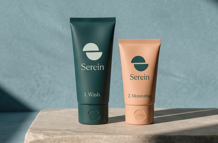
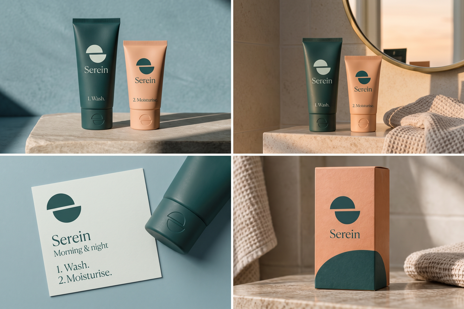
 Cleanser + moisturiserSunset in the mirrorRoutine card · AM / PMCarton · FSC board
The brand out in the world. For print and production, use the editable vector files.
The idea behind it
A business first.
An identity with purpose.
Serein is a concept brand for a skincare range with exactly two products: a cleanser and a moisturiser. Use both in the morning and again at night. That is the whole routine, and the packaging says so on the front.
Serein is an old French word for the fine rain that falls from a clear sky just after sunset. The symbol is two half circles, a setting sun and its reflection, offset so they also form an S. It is as calm and simple as the routine: two parts, morning and night.
The identity system
Everything Serein needs to show up the same way, everywhere.
01Primary logo
02Logo mark alone
03Clear space
04Color system
#245F5DSymbol and essential information
#EDF4ECLabels and backgrounds
#AFD0D7Supporting product fields
#EBC0A1Warm printed accents
Watch: Split circles are a familiar geometric form. The offset that makes the S, and the story behind the name, are what make it Serein's; keep both.
05Brand pattern
06Typography
Wash. Moisturise. That's it.
A short skincare routine with a calm symbol taken from the meaning of its name.
- Display · 56pxSerein
- Heading · 30pxSerein
- Body · 16pxSerein
- Caption · 12pxSerein
07Signage
08Stationery
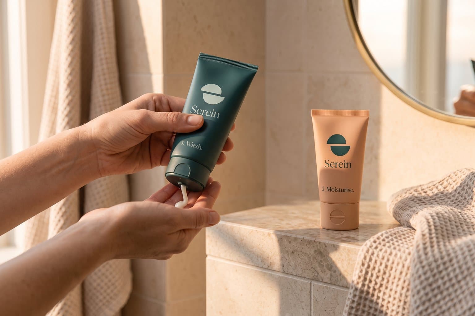
09In use
The voice
Wash. Moisturise. That's it.
Clear and reassuring. Says what to do, then stops.
In everyday life
Designed to leave the screen.
- The symbol embossed on a tube cap.
- A two-step routine card: 1. Wash. 2. Moisturise.
- A carton with the sun half on the front and the reflection on the back.
Borrow the thinking
What could your
brand take from this?
- 01A name with a story is a ready-made symbol.
- 02Let the shape echo how the product is used.
- 03Put the routine on the pack, not in a leaflet.
Your next chapter
A starting point.
Ready for your story.
Start from this brief, keep what fits and make it your own. Add your business name and BranDoor shapes everything around you.
Build my brand from this ↗Take the starter assets
Open any file to preview it here; download it when you're ready to use it.
Editable symbol

Brief & color palette
- What it is
- A two-product skincare routine (cleanser and moisturiser) with clear instructions, and a symbol of a setting sun and its reflection forming an S.
- Who it's for
- Adults who want a simple, understandable routine and calm packaging without complicated steps.
- Personality
- Keywords
- Avoid
- Palette
- Deep teal
#245F5DMist#EDF4ECWater#AFD0D7Apricot#EBC0A1 - Type · Voice
- Quiet contemporary serif + highly legible sans. Clear and reassuring. Says what to do, then stops.
Mini brand guide
Serein — starter guide
The story
Serein is a concept brand for a skincare range with exactly two products: a cleanser and a moisturiser. Use both in the morning and again at night. That is the whole routine, and the packaging says so on the front.
The symbol
Serein is an old French word for the fine rain that falls from a clear sky just after sunset. The symbol is two half circles, a setting sun and its reflection, offset so they also form an S. It is as calm and simple as the routine: two parts, morning and night.
Color
- Deep teal #245F5D — Symbol and essential information
- Mist #EDF4EC — Labels and backgrounds
- Water #AFD0D7 — Supporting product fields
- Apricot #EBC0A1 — Warm printed accents
Deep teal is the evening sky and keeps information readable. Mist and water are soft label colors, and apricot is the last light of the sunset.
Typography
Quiet contemporary serif + highly legible sans. A light serif sets a calm tone for the name. Directions and ingredients use a clear sans with generous spacing, because they are read in a steamy bathroom.
Voice
Clear and reassuring. Says what to do, then stops. Example: “Wash. Moisturise. That's it.”
What to borrow
- A name with a story is a ready-made symbol.
- Let the shape echo how the product is used.
- Put the routine on the pack, not in a leaflet.
Concept brands are open starting points. Add your own name, adapt the artwork and make it yours. The typography is a direction to pair with fonts you choose.