
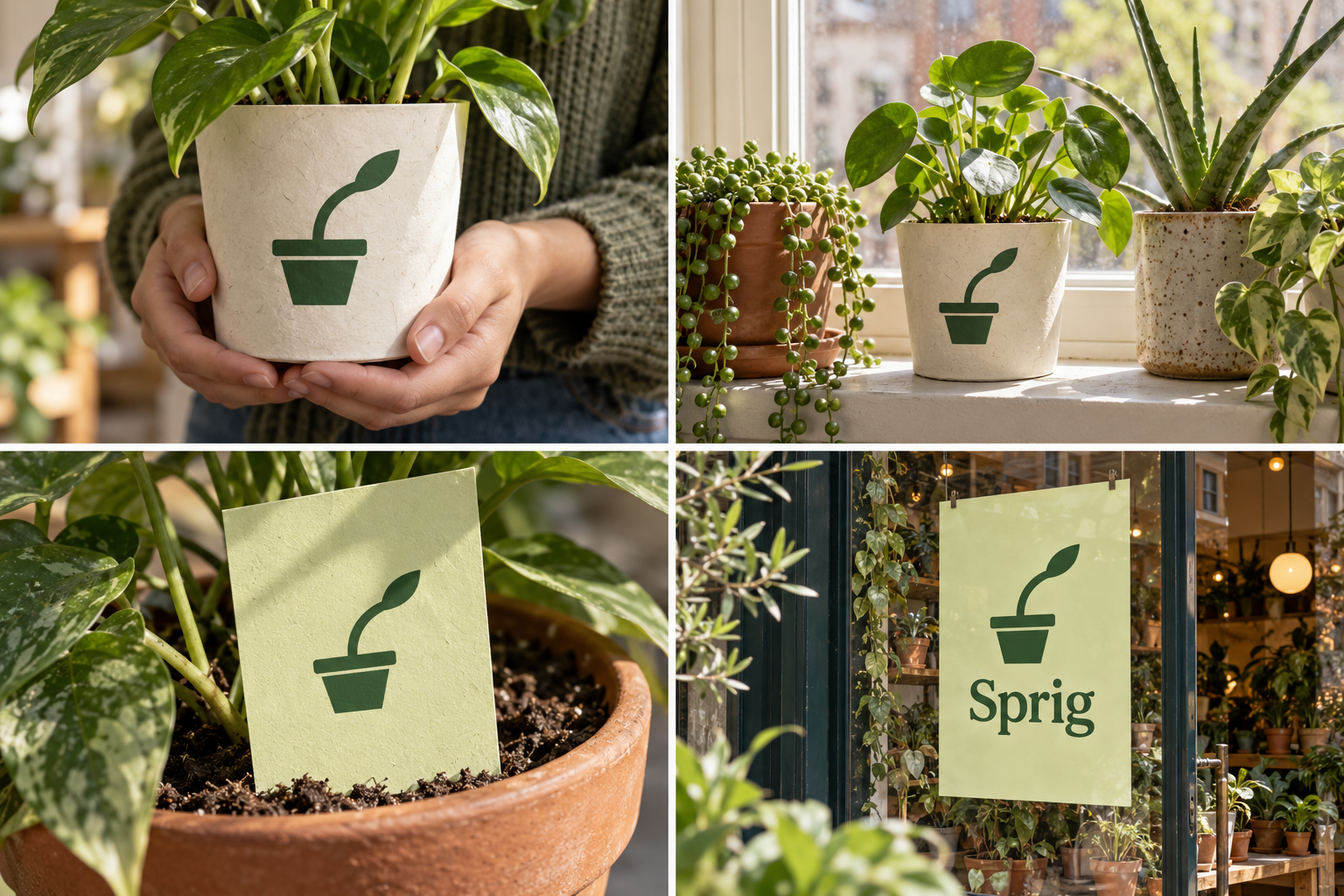
 Pot sleeve · 12 cmHerb pot · indoorCare card · water weeklyWindow decal
The brand out in the world. For print and production, use the editable vector files.
The idea behind it
A business first.
An identity with purpose.
Sprig is a concept brand for a plant shop for people growing on windowsills and tiny balconies. It runs a free 'plant clinic' every Sunday: bring in a sad plant, get honest advice and a cutting to take home.
Every plant on a windowsill does the same thing: it leans towards the light. Owners notice it and turn the pot. The symbol is a plant in a pot, leaning hard to one side. It is a small, funny truth anyone who has kept a plant will recognize, and it turns the shop's best advice into a picture.
The identity system
Everything Sprig needs to show up the same way, everywhere.
01Primary logo
02Logo mark alone
03Clear space
04Color system
#326239Plant symbol and main labels
#EFF2D4Care cards and backgrounds
#343A2BPlant information
#E8BC4FClinic and workshop accents
Watch: Green is common for plant shops. The leaning stem is what makes it Sprig's; keep the angle consistent in every use.
05Brand pattern
06Typography
Turn the pot a little every Sunday.
A plant shop for small spaces, with a symbol every plant owner has seen on their own windowsill.
- Display · 56pxSprig
- Heading · 30pxSprig
- Body · 16pxSprig
- Caption · 12pxSprig
07Signage
08Stationery
09In use

The voice
Turn the pot a little every Sunday.
Patient and encouraging. No question is too basic.
In everyday life
Designed to leave the screen.
- The lean printed on a plant-pot sleeve.
- A care card: light, water and 'turn it on Sundays'.
- A Sunday plant-clinic poster for the window.
Borrow the thinking
What could your
brand take from this?
- 01Turn your best advice into a picture.
- 02Humor comes from a true observation.
- 03One distinctive angle can make a familiar subject your own.
Your next chapter
A starting point.
Ready for your story.
Start from this brief, keep what fits and make it your own. Add your business name and BranDoor shapes everything around you.
Build my brand from this ↗Take the starter assets
Open any file to preview it here; download it when you're ready to use it.
Editable symbol

Brief & color palette
- What it is
- A friendly plant shop for windowsills and small balconies with a free Sunday plant clinic, and a symbol of a potted plant leaning towards the light.
- Who it's for
- Apartment dwellers and new plant owners who want practical, patient advice.
- Personality
- Keywords
- Avoid
- Palette
- Leaf
#326239Pale lime#EFF2D4Soil#343A2BMarigold#E8BC4F - Type · Voice
- Soft rounded sans + practical text sans. Patient and encouraging. No question is too basic.
Mini brand guide
Sprig — starter guide
The story
Sprig is a concept brand for a plant shop for people growing on windowsills and tiny balconies. It runs a free 'plant clinic' every Sunday: bring in a sad plant, get honest advice and a cutting to take home.
The symbol
Every plant on a windowsill does the same thing: it leans towards the light. Owners notice it and turn the pot. The symbol is a plant in a pot, leaning hard to one side. It is a small, funny truth anyone who has kept a plant will recognize, and it turns the shop's best advice into a picture.
Color
- Leaf #326239 — Plant symbol and main labels
- Pale lime #EFF2D4 — Care cards and backgrounds
- Soil #343A2B — Plant information
- Marigold #E8BC4F — Clinic and workshop accents
Leaf green is for the symbol and labels. Pale lime keeps care cards bright, soil carries information, and marigold flags the Sunday clinic.
Typography
Soft rounded sans + practical text sans. Rounded lettering makes advice feel friendly. Plant names, light needs and watering notes stay in a plain sans so beginners can follow them.
Voice
Patient and encouraging. No question is too basic. Example: “Turn the pot a little every Sunday.”
What to borrow
- Turn your best advice into a picture.
- Humor comes from a true observation.
- One distinctive angle can make a familiar subject your own.
Concept brands are open starting points. Add your own name, adapt the artwork and make it yours. The typography is a direction to pair with fonts you choose.