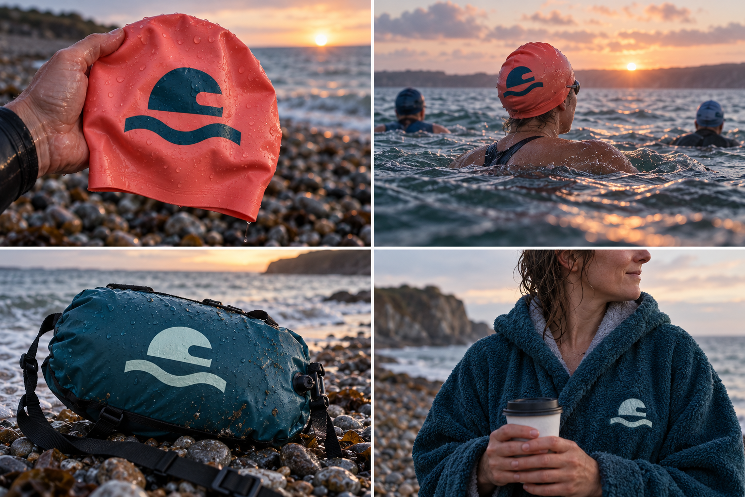
 Silicone cap · one sizeTwo-color cap printTow float · 20 LFleece robe · embroidered
The brand out in the world. For print and production, use the editable vector files.
The idea behind it
A business first.
An identity with purpose.
Tideform is a concept brand for a swimwear label that started with a group of friends who swim in the sea at 6am, all year. It makes warm caps, tow floats and suits for people who swim for the cold, the company and the coffee afterwards.
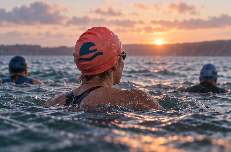
Every few strokes, an open-water swimmer lifts their eyes just above the surface to check where they are going. Swimmers call it sighting. The symbol is that moment: a capped head with goggles, just clear of the waterline. Swimmers recognize it straight away, and it fits on the side of a real swim cap.
The identity system
Everything Tideform needs to show up the same way, everywhere.
01Primary logo
02Logo mark alone
03Clear space
04Color system
#145A68Symbol and signature fabrics
#EAF5EFLight fields and packaging
#91D9C8Secondary swim colors
#F18B72Caps, tow floats and tags
Watch: Wavy waterlines are common in swim branding. Here the head and goggles do the distinctive work; never use the wave without them.
05Brand pattern
06Typography
Eyes up. Keep going.
Open-water swim gear, marked by the moment a swimmer lifts their eyes above the water.
- Display · 56pxTideform
- Heading · 30pxTideform
- Body · 16pxTideform
- Caption · 12pxTideform
07Signage
08Stationery
09In use
The voice
Eyes up. Keep going.
Cheerful and unhurried, like the chat on the beach after a swim.
In everyday life
Designed to leave the screen.
- The sighting swimmer on the side of a coral swim cap.
- A one-color transfer on a tow float.
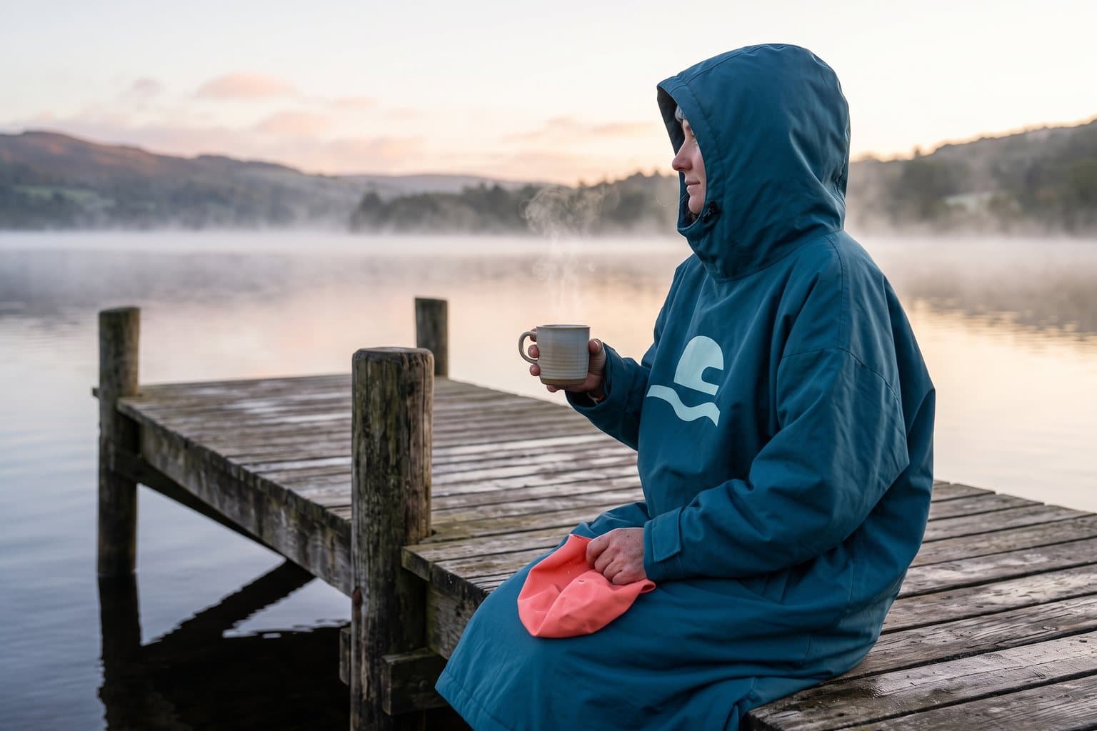
- A changing-robe patch for the walk back up the beach.
Borrow the thinking
What could your
brand take from this?
- 01Find the gesture only your customers make.
- 02Put the symbol on the object they wear in the moment it shows.
- 03A cliché element (the wave) is fine when something specific sits on it.
Your next chapter
A starting point.
Ready for your story.
Start from this brief, keep what fits and make it your own. Add your business name and BranDoor shapes everything around you.
Build my brand from this ↗Take the starter assets
Open any file to preview it here; download it when you're ready to use it.
Editable symbol

Brief & color palette
- What it is
- Swim caps, tow floats and suits for year-round open-water swimmers, with a symbol showing a swimmer lifting their eyes above the water.
- Who it's for
- Recreational sea and lake swimmers who swim in groups, early, all year, and value warmth and visibility.
- Personality
- Keywords
- Avoid
- Palette
- Marine
#145A68Salt#EAF5EFAqua#91D9C8Cap coral#F18B72 - Type · Voice
- Wide sans + understated italic accents. Cheerful and unhurried, like the chat on the beach after a swim.
Mini brand guide
Tideform — starter guide
The story
Tideform is a concept brand for a swimwear label that started with a group of friends who swim in the sea at 6am, all year. It makes warm caps, tow floats and suits for people who swim for the cold, the company and the coffee afterwards.
The symbol
Every few strokes, an open-water swimmer lifts their eyes just above the surface to check where they are going. Swimmers call it sighting. The symbol is that moment: a capped head with goggles, just clear of the waterline. Swimmers recognize it straight away, and it fits on the side of a real swim cap.
Color
- Marine #145A68 — Symbol and signature fabrics
- Salt #EAF5EF — Light fields and packaging
- Aqua #91D9C8 — Secondary swim colors
- Cap coral #F18B72 — Caps, tow floats and tags
Marine keeps the symbol crisp. Salt makes room for product information, aqua is shallow water, and coral is the bright cap color swimmers spot from the shore.
Typography
Wide sans + understated italic accents. Wide, steady letters read well printed on a curved cap. Italic is kept for short motion words; sizes and fabric care stay upright and clear.
Voice
Cheerful and unhurried, like the chat on the beach after a swim. Example: “Eyes up. Keep going.”
What to borrow
- Find the gesture only your customers make.
- Put the symbol on the object they wear in the moment it shows.
- A cliché element (the wave) is fine when something specific sits on it.
Concept brands are open starting points. Add your own name, adapt the artwork and make it yours. The typography is a direction to pair with fonts you choose.